I didn’t have the stomach to pack so many pies in a single blog – so here’s a second serving. If only the authors’ had to eat their own words…
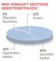
Fortunately, not all pie charts are as bad as those that show time structures. The standard pie chart, however, is simply a waste of space. The fact is that humans aren’t particularly good at judging segments. If they happen to equal exactly ¼, ½ or ¾, then you’re in luck because 90° and 180° angles are rather easy to identify. Otherwise, however, you have no chance. Take the chart below. You have to read it to understand about the debt of US households:
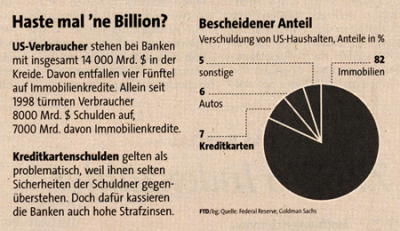
A superfluous pie chart (Financial Times Deutschland, 21.11.2008, S. 18)
Yet, what is the point of using graphical elements in the first place if you are forced to read them to understand them? And if you did read it, all you’d find behind the fancy packaging are a few crumbs of information. What a disappointment! The redesign below shows that little data with lots of embellishment is not an option – especially in management reporting. If you only have four values to begin with, why hem and haw about them as well?
After taking a second look, you can clearly see that the chart only contained four values.
Pies are really pathetic when you don’t have a lot of data. If you have too much, however, they are too hard to label. In the original pie chart below, you can see that two elements each make up a quarter of the total market. Luckily, you can quickly identify 90° segments. If you want to understand the rest, however, your eyes will start to rotate in circles. You can almost imagine how painstaking it was to draw all of the connecting lines just to give an impression of the sugar beet market!
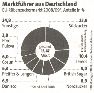
Fragmented pie chart showing Europe’s leading producers of sugar beets (Financial Times Deutschland, 16.07.2008, without page)
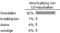
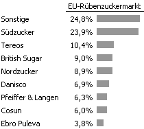
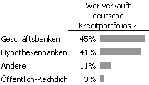
In a simple bar chart, the values would be placed where they belong – namely, next to each other so that the reader can compare them. That could look like this:
Sugar beet data (without the sugar on top)
This way, you could even place the countries behind the company names so that you could muse about the market shares within Europe.
Flying pie charts that hover around in space make a bad situation even worse. It’s depressing how long you spend trying to make some sense out of the four numbers that the chart offers. Since it’s even harder to assess and compare segments in 3D, it makes you wonder if the people who make these charts even care about the numbers that they should be visualizing. Jon Peltier calls this ‘chartainment’.
 |
 |
|
Welt am Sonntag, 4, |
Our redesign |
The following pie chart, which shows the global market share for manufacturers of printing presses, is one mystery that no one wants to solve. Let’s do without silly pranks like starting in the middle of nowhere, grouping and sorting only half of the values, or the random use of colors.
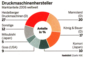
Strange: Companies in Orangeland are grouped together, but those from Japan aren’t. (Handelsblatt 111, 11.6.2008, p. 15)
The chart below – which shows the planned revenues, expenses and investments in 2009 for a large German municipality – is simply illegible. That’s too bad because the numbers would have been interesting. These aren’t wild guesses. This is reality for taxpayers and the data is detailed, too. But until you finally sort and understand what it’s trying to say, you have probably already lost any serious interest.
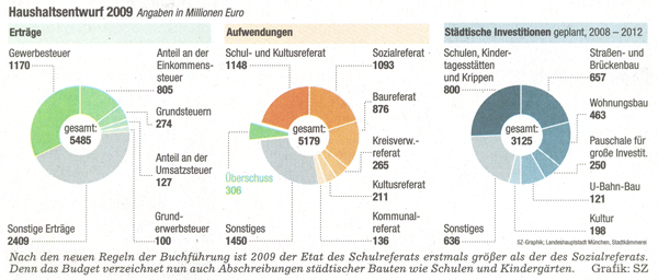
Illegible – even if you click to enlarge (Süddeutsche Zeitung, Nr. 164, 16.07.2008, p. 38)
A normal presentation would hold your attention and make you want to ask why the second chart shows a surplus while the numbers tell a different story.
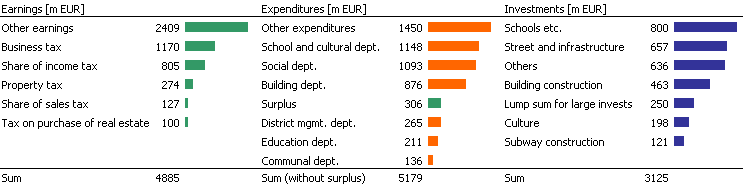
Small but still understandable. Click to enlarge.
And if you still didn’t have your fill, we have one last chart that makes the examples above look appetizing, Germany’s leading newspaper tabloid Bild shows how you can still make a lumpy chart with missing pieces nice and round.
Now here’s something uplifting for a change. Three random issues of the Wall Street Journal contained the optimal number of pie charts: 0.
