Whether it’s Barbie and Ken, Madame Tussaud, Playmobil or even the ‘Männleinlaufen’ in Nuremberg – people as figurines are either fun or educational. But as we can see from the following examples and exceptions, the exact opposite usually holds true for data visualization.
If you visited our Christmas market (Christkindlesmarkt) in Nuremberg over the past few weeks, you probably had the opportunity to observe the ‘Männleinlaufen’ at 12 noon. This world-famous clock above the city’s main market (Hauptmarkt) is truly a piece of art. A herald appears and a marshal gives the beat for a group of trombone, flute and drum players who welcome the seven electors. Carrying the imperial regalia, they bow and circle three times around the Emperor Karl IV who greets them with a scepter in hand. These figurines, which are over 500 years old, survived two world wars and still run today.

Figurines that work: Bechtle AG shows its growth from one employee in 1983 to 4,250 in 2007 (closer view).
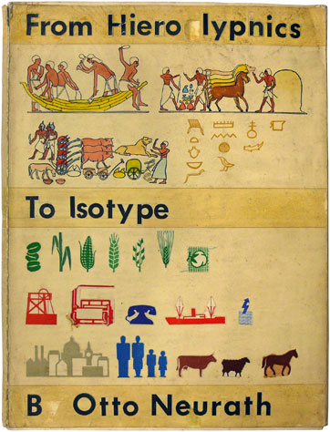
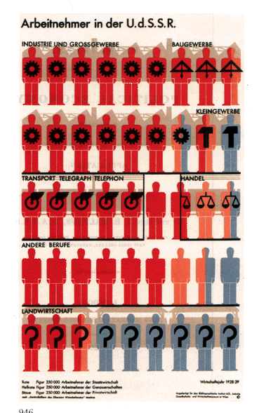
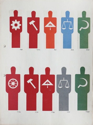
The visionary Otto Neurath, a highly educated man who was well versed in picture languages dating back to hieroglyphics, invented pictorial statistics back in the 1920’s. Figurines also played a key role here as well. As we can see in this example, pictorial statistics use minimalistic, standardized symbols that are free of unnecessary decoration. Another important aspect is that they use many similar symbols – and not simply different sizes – to represent numerical proportions. Pictograms, which we can attribute to Neurath, still help us find our way around airports, train stations, etc. today.
In the foyer of Bechtle AG’s corporate headquarters in Neckersulm, Germany, visitors can witness a piece of its corporate history. Using simple board game pawns, the company shows its astonishing workforce development in a highly effective yet humorous way. Equally impressive is the accompanying display that uses labeled hurdles to show its sales growth from €33,000 in 1983 to €1.4 billion in 2007.
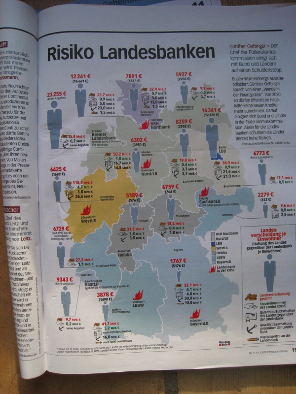
In contrast a graphic from the magazine ‘Wirtschaftswoche’ (No. 11, 2009-03-09, p. 15) is a near caricature of Otto Neurath’s approach (I personally find the visualization confusing and feel that mixing terms like ‘debt’, ‘risks’ and ‘liabilities’ is completely biased – but that’s beside the point). Although the figurines resemble the standards developed by Neurath and the graphic designer Gerd Arntz, they vary in size and not in number. We’ve discussed the problems associated with spatial graphics on multiple occasions. What I particularly find annoying is that people can have debt but debt isn’t made up of people. Otherwise, we should think long and hard if we really want something today to look like it’s stuck in the 1920’s. After all, Neurath’s pictorial statistics were designed to give illiterate or poorly educated people the knowledge they need to successfully participate in a democracy.
The Wall Street Journal (WSJ, 2009-11-13, p. 9) recently asked 52 economists where they expect the next bubble to emerge in financial markets. The charm of the selected visualization lies in the transparency of the underlying data.
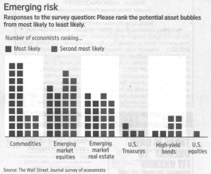
A treasure upon closer examination: The reference to opinion and person remains visible (Source: Wall Street Journal, 2009-11-13, p. 9).
The graphic designer could have closed the bars, labeled them or simply used percentages instead but chose not to. The fact that the tally is missing is a nice reminder that this graphic shows trends and nothing more. The summary of ‘Most likely’ and ‘Second most likely’ into segments makes other aspects of the data clearer as well. The approach that the Sunday edition of ‘Die Welt’ took in its panel of entrepreneurs is cryptic in contrast. Here, the opinions of twelve general managers from midsize companies are simply lumped together in an index (WAMS, 2009-03-16, p. 29).
The topic of people and graphical figurines is multifaceted. Even Bella has given it some thought – and quickly discovered what additional problems can occur when analog stick figures are supposed to represent percentages. Neurath’s abstraction in which one figure, for example, stands for 250,000 workers in the Soviet Union is a talent that needs to be learned. In general, stick figures work the best when one figure stands for one person. That’s why the figurines at Bechtle are so effective – and the ones high above the Christkindlesmarkt have been as well for over 500 years.
