A chart from the German newspaper ‘Welt am Sonntag’ distorted the facts by more than seven times. In Part 1, we reviewed Bella’s law of proportionality, measured it with the lie factor and tried to save the world through standardization. Today, we will tame the tiger for good.
Jon Peltier has followed our efforts and recommends using a logarithmic axis. Rightly so! In a logarithmic scale, the chart conveys the same message as the numbers. The original (i.e. in the upper right-hand corner) showed a steeper increase for electricity than gas. Heating oil virtually exploded. In the chart below, the proportions are back in order. The slopes of the lines reflect the value changes of 122, 83 and 36 percent:
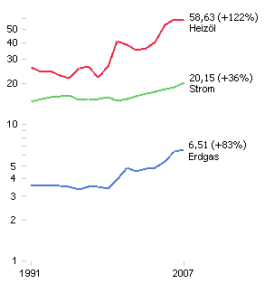
Therefore, a logarithmic scale shows relationships in the proper proportions. But why?
The tiger’s secret: identical decimal places
Logorithms have many advantages. We can see one of them in the following table which shows logarithmic values from 10 to 100 and from 100 to 1000.
| y | 10 | 20 | 30 | 40 | 50 | 60 | 70 | 80 | 90 | 100 |
|---|---|---|---|---|---|---|---|---|---|---|
| lg(y) | 1,00 | 1,30 | 1,48 | 1,60 | 1,70 | 1,78 | 1,85 | 1,90 | 1,95 | 2,00 |
| y | 100 | 200 | 300 | 400 | 500 | 600 | 700 | 800 | 900 | 1000 |
| lg(y) | 2,00 | 2,30 | 2,48 | 2,60 | 2,70 | 2,78 | 2,85 | 2,90 | 2,95 | 3,00 |
The decimal places are identical by pairs. We can use them to construct a logarithmic scale in which we write our Y values on a vertical axis but use our logarithms for the actual intervals. As a result, the chart will show the same percentage changes with the same slope. In numbers, that means that a 50 percent change from a value of 20 to a value of 30 would be displayed on the Y axis with a slope of .18 (i.e. 1.48 – 1.30). The equally 50 percentage change from a value of 200 to a value of 300 would also be .18 (2.48 – 2.30). On a “normal” scale, in comparison, we would compare the increases of 10 (30 – 20) and 100 (300 – 200). We can see those results on the chart on the upper-right hand side of this page.
Newspapers use logarithmic scales even less frequently than standardized presentations. As we can see, they require an explanation. That and a few other reasons, which are irrelevant for our case in point, have led some to compare their usage with riding a rabid tiger while blindfolded and under sedation. That is absolute nonsense.
“In order to represent comparable percentage changes, the scale is logarithmic.“
One can really interpret the parallel history of falling stock prices that way – without thinking that it is the result of poor scaling. The Times does a superb job of combining data, text and images into a meaningful, highly informative, pooled message. If you take a closer look, you even understand the logarithm quickly. It’s actually quite surprising that you don’t encounter them more often.
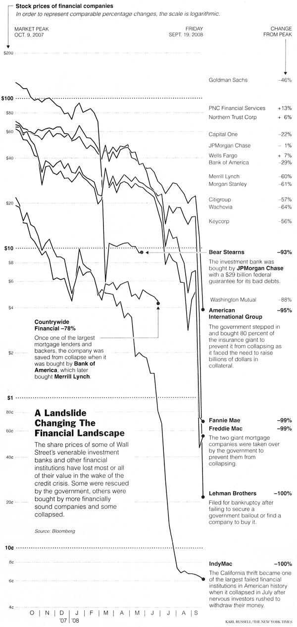
Source: New York Times, September 21st, 2008, p. 19. Click to enlarge.
Whether you are an avid reader of the New York Times, a controller or manager, you know from now on that the rabid tiger is really nothing more than a harmless kitten.
