Many charts play tricks with our eyes and manipulate our intuition. They lead us to believe that parallel developments don’t exist and gaps are actually parallel. That’s deceiving. With this simple rule of thumb, however, you can easily detect when a chart isn’t telling the truth.
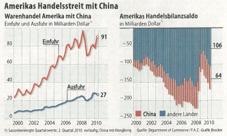
The United States and China are quarreling about the U.S. trade deficit to China. You can see why instantly: The gap between imports and exports has been increasing dramatically since the year 2000. Hasty readers, who are happy that a chart explained the world to them so quickly, will simply turn the page. The readers of this blog, however, will pause, assess the start and end values for imports and exports, and grab a calculator.

The U.S. is at odds with China. When you see this chart, you might think that you immediately understand why. The gap between imports and exports keeps growing. Oh, really? – Source: FAZ, 2010-09-27, page 13.
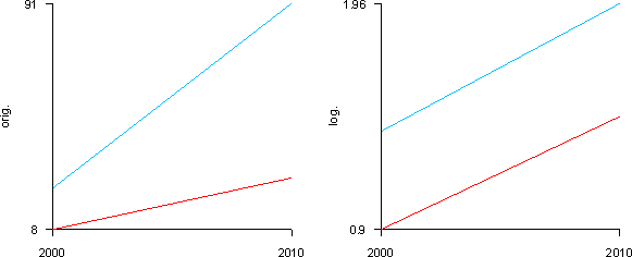
I took the end values, $91 billion for imports and $27 billion for exports, and estimated the initial values at $23 billion for imports and $8 billion for exports. The absolute increase would then be 91 – 23 = 68 and 27 – 8 = 19. As a percentage, imports increased 404% and exports grew by 338 %. Wait a minute! Once again, my eyes were fooled by a linear scale. By checking a simplified form of the data (i.e. the start and end values), you can see that the gap is an artifact of the linear scale. If you used a logarithmic scale, the two lines would almost resemble a parallelogram.

Left: Linear scale (as in the original chart). Right: Logarithmic scale. The logarithmic scale shows that the allegedly growing gap is actually something more on the lines of a parallelogram. The left chart exaggerates the truth by a factor of 3.17.
In a few weeks in Berlin, we will make a plea to accept intuition as a legitimate de facto part of every business decision. Intuition, however, is self-deception when the foundation for making decisions is corrupt. This brings us back once again to charts and the responsibility that their makers have.
Since newspapers rarely use logarithmic scales, you can’t read them intuitively. What’s more, you even have to be skeptical of every tiny, little graphic. That makes reading charts a costly endeavor. When you see a linear scale, you cannot tell how the same data would look in a logarithmic scale if you don’t do the math yourself. For this reason, we have constructed a small lie detector test for graphics.
This ‘Lie-Chart Detector’ is a rule of thumb that you can apply to the upper line when you have two lines in a linear scale. It calculates the factor that the slope of the linear scale deviates from that of a (correct) logarithmic scale. The further this factor is from 1, the greater the exaggeration of the slope is. In the graphic above, for example, the exaggeration factor is 3.17.
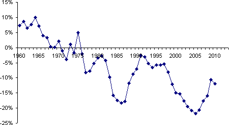
Going back to the trade deficit – I don’t want to question the arguments of the U.S. against China. As you can see by taking a closer look at a sincere chart, things are more complicated than they appear to be as usual. The chart below shows the balance between imports and exports as a percentage of the total trade volume. Even if you display imports and exports in a logarithmic scale, it is hard to make a bottom-line statement. This is a problem that even William Playfair couldn’t solve over 200 years ago..

The balance between imports and exports as a percentage of the total trade volume from 1960 to 2010.
In reality, the U.S. trade balance with China has had a very turbulent history with long periods of both continued growth and decline. Between 1998 and 2005, the U.S. trade deficit increased progressively. While it decreased between 2005 and 2009, it is currently growing again.
As long as logarithmic scales do not attain the acceptance they deserve, you cannot rely on your eyes to read most charts. At least now, you can use this rule of thumb to judge things for yourself.
