Analyzing means comparing. That is our central rule here. Comparing, however, rarely suffices as a comparison. Mostly you have to do some subtracting first. Not till then you see what there is to see.
The strain on your eyes is really heavy if you ought to identify vertical spacing while horizontal spacing in a chart creates intense patterns.
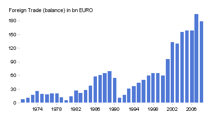
The graphic below from the March 5th 2009 issue of DIE ZEIT is a good example. The line chart shows the development of Germany’s foreign trade in billions of euros. But how high is the trade surplus? How has it developed over the years? How far is the gap between exports and imports widening? Answer: We don’t know. That’s why DIE ZEIT wisely also shows the trade balance as a separate bar chart with a rough five-year grid (for more detail, click here).
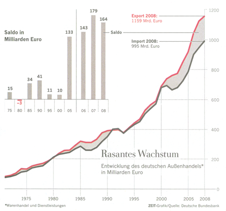
The vertical gaps are impossible to decode. That’s why the trade balance in the time series chart is undecipherable as well (DIE ZEIT, March 5th 2009, p. 25).
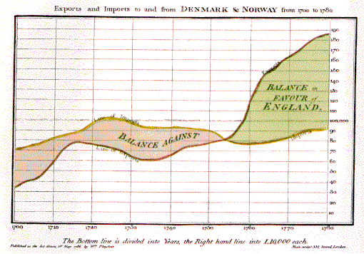
We have been battling this problem since the beginning of line charts – in other words, since William Playfair invented them over 200 years ago. On a side note, his first time series charts were also used to analyze trade balances. In the following chart, Playfair shows England’s trade deficit to Asia. Another one shows the trade balance with Norway.
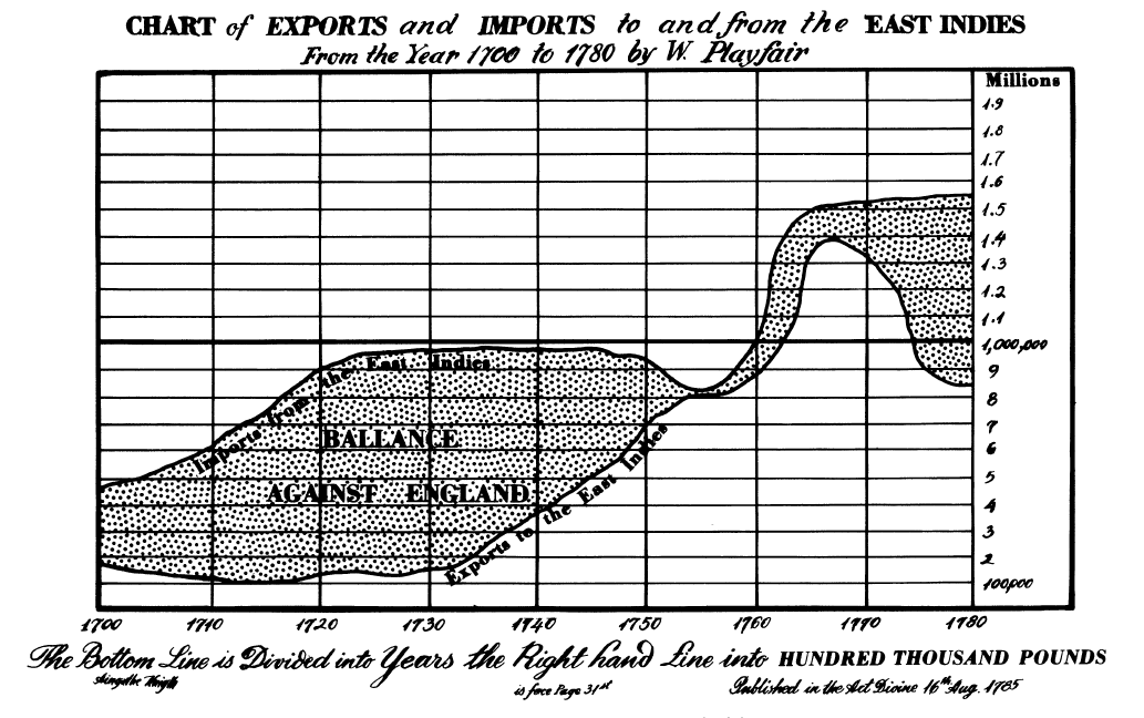
Playfair’s first line chart ever, which dates back to 1785, is difficult to read due to the same problem described above. Click image to enlarge.
Attempting to show developments based on a single measure has its pitfalls. And comparing two measures is even more challenging.
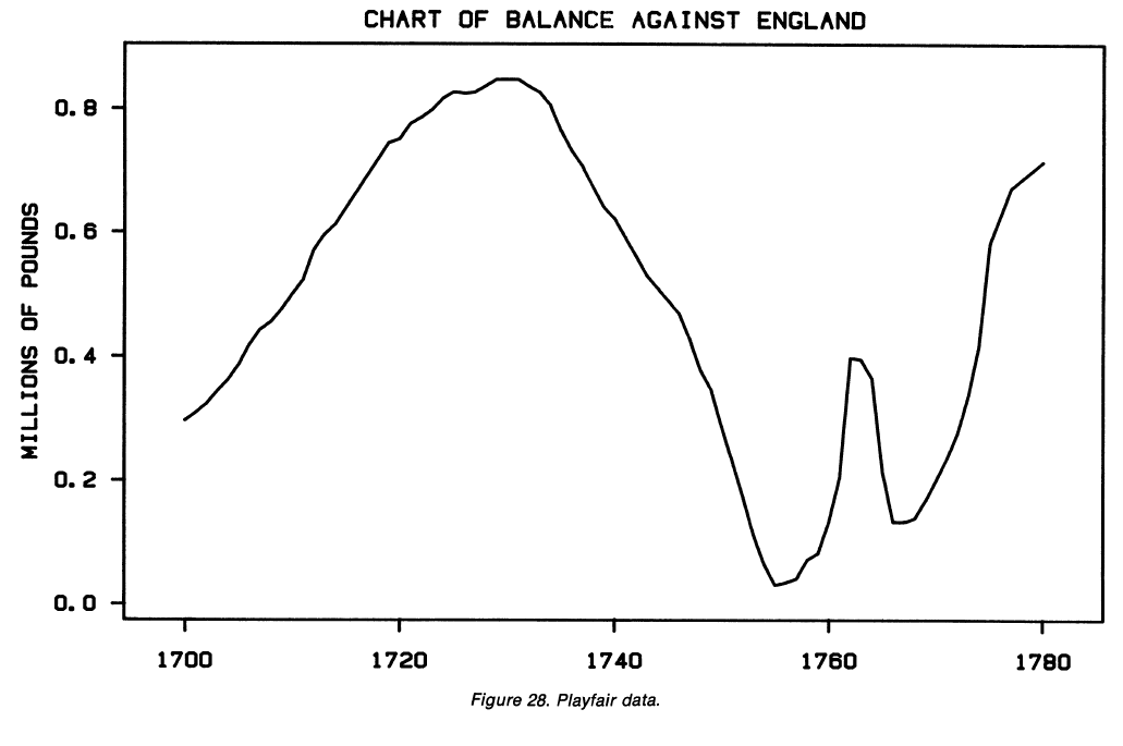
Cleveland and McGill have illustrated that a long time ago using Playfair’s data. I took the liberty to reconstruct the data from their chart and expand on their example. If you want to experiment a bit yourself, you can get the data I used here.
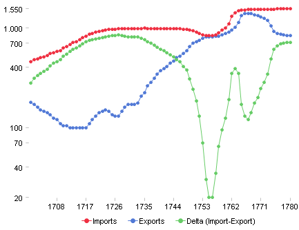
Based on the original drawing, we believe that the trade balance after 1760 was relatively small and constant. How much that cheats proves once again the green Delta Line (for a logarithmic alternative, click here).
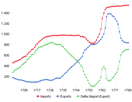
Imports, exports and deltas: Now you can clearly see the development.
(Image: DeltaMaster)
What lessons can controllers learn from this? As we have already seen in the case of unstacking stacked charts, the raw data rarely suffices. Controllers have to master the deltas. When you are comparing two values, always include their difference as well. In other words, simple subtraction is the least that we should do.
