CiAgICA8IS0tIExpbmtlZEluIC0tPgogICAgPHNjcmlwdCB0eXBlPSJ0ZXh0L2phdmFzY3JpcHQiPgogICAgICAgIF9saW5rZWRpbl9wYXJ0bmVyX2lkID0gIjEyMzUwNzMiOwogICAgICAgIHdpbmRvdy5fbGlua2VkaW5fZGF0YV9wYXJ0bmVyX2lkcyA9IHdpbmRvdy5fbGlua2VkaW5fZGF0YV9wYXJ0bmVyX2lkcyB8fCBbXTsKICAgICAgICB3aW5kb3cuX2xpbmtlZGluX2RhdGFfcGFydG5lcl9pZHMucHVzaChfbGlua2VkaW5fcGFydG5lcl9pZCk7CiAgICA8L3NjcmlwdD48c2NyaXB0IHR5cGU9InRleHQvamF2YXNjcmlwdCI+CiAgICAgICAgKGZ1bmN0aW9uKCl7dmFyIHMgPSBkb2N1bWVudC5nZXRFbGVtZW50c0J5VGFnTmFtZSgic2NyaXB0IilbMF07CiAgICAgICAgICAgIHZhciBiID0gZG9jdW1lbnQuY3JlYXRlRWxlbWVudCgic2NyaXB0Iik7CiAgICAgICAgICAgIGIudHlwZSA9ICJ0ZXh0L2phdmFzY3JpcHQiO2IuYXN5bmMgPSB0cnVlOwogICAgICAgICAgICBiLnNyYyA9ICJodHRwczovL3NuYXAubGljZG4uY29tL2xpLmxtcy1hbmFseXRpY3MvaW5zaWdodC5taW4uanMiOwogICAgICAgICAgICBzLnBhcmVudE5vZGUuaW5zZXJ0QmVmb3JlKGIsIHMpO30pKCk7CiAgICA8L3NjcmlwdD4KICAgIDxub3NjcmlwdD4KICAgICAgICA8aW1nIGhlaWdodD0iMSIgd2lkdGg9IjEiIHN0eWxlPSJkaXNwbGF5Om5vbmU7IiBhbHQ9IiIgc3JjPSJodHRwczovL3B4LmFkcy5saW5rZWRpbi5jb20vY29sbGVjdC8/cGlkPTEyMzUwNzMmZm10PWdpZiIgLz4KICAgIDwvbm9zY3JpcHQ+CiAgICA8IS0tIEVuZCBMaW5rZWRJbiAtLT4KICAgIA==
Generic filters
Exact matches only
Search in title
Search in excerpt
Search in content

Sure-fire ways to spoil data, Part II

Last time, we took a look at six of Howard Wainer’s golden rules to ruin data. To double your pleasure, we decided to explore six more:

  1. Emphasize the trivial (ignore the important). If you want to explain how salaries have changed over time based on education and gender, segregate this information into two separate charts for women and men.
  1. Jiggle the baseline. Add small values to larger ones by stacking them together. Even the smartest of bystanders will not notice the changes in the smaller values.
  1. Austria first. Always sort your chart in alphabetical order and never by analytical content. If someone complains, defend yourself by saying that it is easier to locate a specific entry that way.
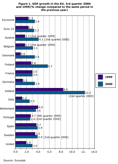
  1. Label (a) illegibly, (b) incompletely, (c) incorrectly, and (d) ambiguously. The true connoisseur uses the same abbreviations for different words within a series of charts.
  1. More is murkier: (a) More decimal places and (b) more dimensions. Use the maximum number of decimal spaces that Excel offers – no matter how unreliable the data are. Don’t forget rule #4: Use area as a visual effect even when it is not appropriate for the data.
  1. If it has been done well in the past, think of another way to do it. Many of today’s effective visualization methods have been around for centuries. Fortunately, modern data analysis software offers a lot of fancy options, so you can easily digress from what is tried and true.

Source: How to Display Data Badly, Howard Wainer, The American Statistician, Vol. 38, No. 2 (May, 1984), pp. 137-147