In his bestseller “The Situation Is Hopeless, but Not Serious”, Paul Watzlawick describes how people can pursue unhappiness (or remain unhappy if they already are). In a similar yet unrelated topic, Howard Wainer explains how people can make consumers of charts miserable as well. According to the American statistician, anyone can succeed in spoiling data by following a few, simple guidelines:
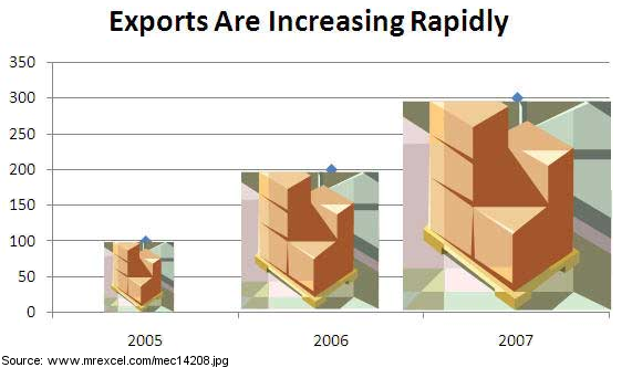
- Show as few data as possible (i.e. Minimize the data density). If the chart looks too empty because it only contains a handful of values, fill the rest with pretty pictures that do nothing to help further explain the facts.
|
 |
- Hide what data you do show. And there are many effective ways to do so. Use a flashy grid and print the data on it – but in a subdued color. Alternatively, you can firmly abide to the “never chop the axes” rule so that the interesting differences among the data are barely visible.
|
 |
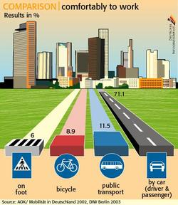
- Ignore the visual metaphor altogether. Do not sort data by size even if the chart type and data allow it. For example, use a bar chart but sort the data in alphabetical order.
|
 |
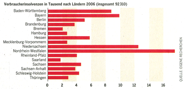
- Only order matters. Use length as a criterion for organizing objects, but confuse readers by showing them as an area. This way, you can magnify even the smallest of differences.
|
 |
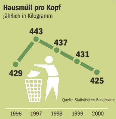
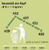
- Graph data out of context. This works well with time-series analyses. If you want to disguise a strong drop of a value, simply start the chart with the following period. If the difference is minimal, just enlarge the scale and compress the X axis.
|
 |
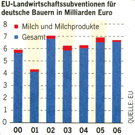
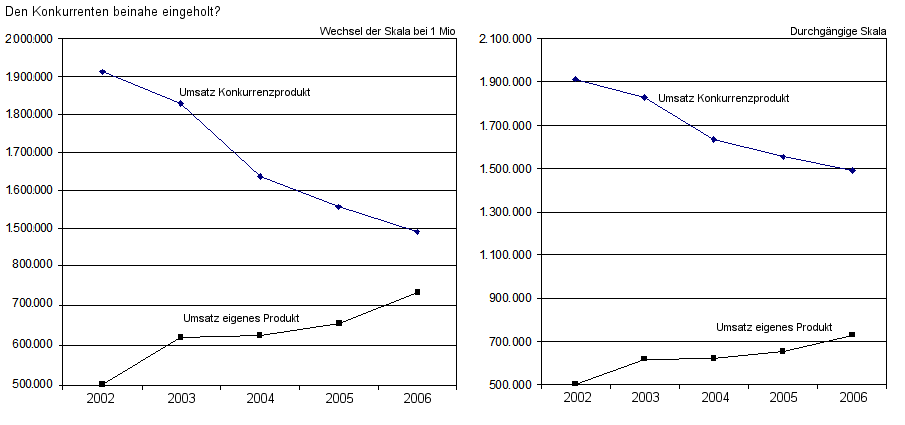
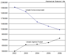
- Change scales in mid-axis. Simply take two rows of data, scale them individually and place each of them into a different chart. Then combine those charts to one – something for connoisseurs.
|
 |