From the chart I read that from 1999 till last year the number of passangers increased to  2.2 bn. During the same period there have been lately per 1 million flights
  0.75 total write-offs for airplanes. The German journal “Der SPIEGEL” sticks to rule 13 vor demolishing charts: Embellish whatever you want to say with numbers that tell a different story!
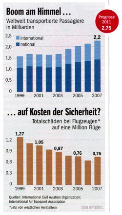
In the text SPIEGEL says: For the first time since 1998 (yes!) there are more total write-offs than the year before. “Flying is secure but starts to become insecure is the statistic’s story. And some flight experts see a dangerous new trend”. I never fly. I am only interested in graphs. That should look like that:
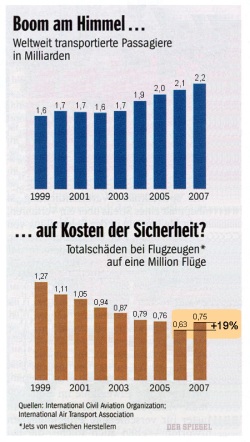
The difference between national/international is ignored by the author, so we don’t need it. Scale and guiding lines don’t help either. Values all the more. AND INCLUDE THE MESSAGE. Not bad.
(Chart: SPIEGEL 22/2008, p. 147, Redesign: ME)