Many concepts feel like “a solution desperately seeking an application“. Sometimes waiting is futile. Square pies are such an issue.
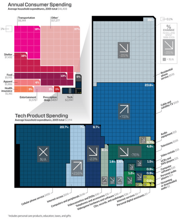
Wired offers a colorful mystery-pie. It argues that household budgets for tech gadgets haven’t changed much in the recent decade. But money is spent for other gadgets nowadays. Square pies don’t help to understand as Anil Dash and Juice Analytics have shown.
I don’t like that Wired inherently focuses on a chronological development, but doesn’t show it.
“High tech gear gets cheaper every year. So we’re spending a lot less on it, right? Um, no. In fact, the proportion of US household budgets spent on tech products and services — computers, game consoles, cell phone service, cable, TVs — has held steady at about 5 percent for most of the past decade. We’re just spending that money — more than we pay for health insurance — on different stuff. For instance, we spend a lot less on TVs (as prices have dropped) but more on cable and satellite services (we need our HBO). Here’s a peek at how our quest to stay wired hits our wallets.”
Source: http://www.wired.com/techbiz/it/magazine/15-08/st_infoporn
The reader has to grasp that a square which is 23.6% large has only been X large before. Because it has increased by 72%. Ah. I didn’t get that. So I made up a table:
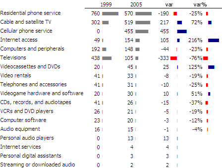
I think know you see what the important items are, how the structure changed and what is new. The longer I looked at the data the more I wanted to know. Add share of total and accumulated views. Only for 2005.
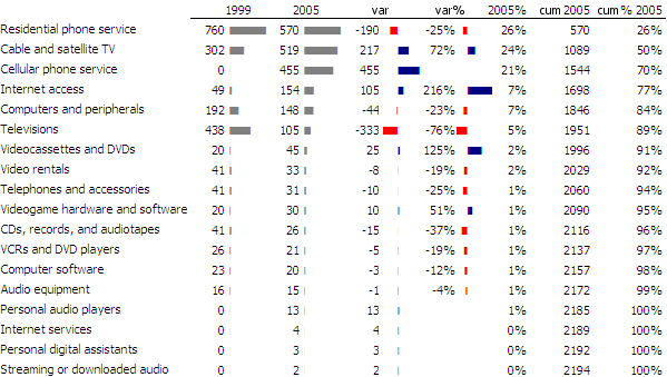
In the end it was clear: there is a whole lot in that data. You get it with a simple table.
The link in Wired is named “Infoporn”. Correctly.