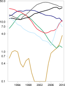
The colored cars again. Did you notice? The values weren’t just tangled up. But incorrectly scaled as well. Brown increased the most. Wasn’t noticeable. Because: The values are so different. Brown is small. Gray is big. This calls for a logarithm. Of course.

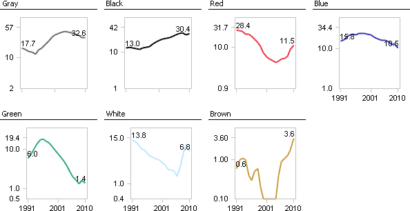
Better, but muddled. Lay it again, Sam? Like last time? You bet. You can tile logarithmically as well. And comparatively. Then it looks like this.

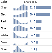
Drawback: You lose the level. Brown is growing strongly, but at a low level. Unfortunately: You can’t get good legibility, correct scale, display of level, and correct dynamics in one chart. A good solution time and time again then: Level with bars, dynamics with columns.

