Data analysis is a true art form. To present your results effectively, you need craftsmanship, creativity and drive.
Appropriately, I find that exhibitions and books about art are a source of inspiration for anyone who deals with data analysis. Matisse, for example, explores the relationship between inside and outside in many of his paintings, where he uses space as a relatively simple medium. He seats elegant women on a balcony with a view of the water front along the Riviera. He illuminates the inside of the room and shows us every detail of its decor. Everything is transparent, spacious and flows like the sea breeze that gently blows the doorway curtain half inside the room, half outside on the balcony.
Presenting your data in a way that unlocks the inner and outer aspects of an analysis is much more difficult. Or at least it appears that way at a first glance. If nothing else, Matisse has inspired me to contemplate how it could work.
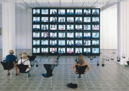
The artist York der Knöfel created short films of New Yorkers telling their life stories. In his exhibit he played the interviews on a total of 48 televisions over six rows. In other words 48 people talked about their lives simultaneously. A headset hung from the ceiling for each television; chairs were scattered below. Whoever took advantage of Knöfel’s offer and listened to the stories was overwhelmed by the exhibit’s impact. A software designer like myself can only dream of this level of power in presentation. Yet is reminds me of the small multiples principle.
The Whitney in New York recently displayed an exhibit on Picasso and American Art from September 28, 2006 through January 28, 2007. (If you missed it, have a look at Michael Fitzgerald’s book.) For many American artists of the 20th century, Pablo Picasso was the central figure of modern art – which, in turn, defined its own artistic achievements through its absorption, criticism or rejection of his example. The exhibit visualizes this through the works of Arshile Gorky, Willem de Kooning, Jackson Pollock, Roy Lichtenstein, Jasper Johns and other artists. New York Times even placed a few examples online. To enable comparisons, the Whitney did the same thing that we need to do in data analysis. It placed the works of Picasso next to those who were influenced by him.
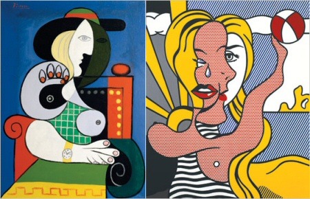
Left: Pablo Picassos “Seated Woman with Wrist Watch” (1932); right: Roy Lichtensteins “Girl with Beach Ball III” (1977).
