Circle charts are generally a no-no for any fan of serious data analysis. But a cardinal rule about rules is that there are always exceptions. Today, we’ll explore if any apply to circles.
Circles are usually annoying because it is harder to estimate the area than the length of something. Although they generally have a bad reputation, there is one good thing about them: Circles can be compared in two directions, vertically and horizontally or by rows and columns. The chart below based on IATA data uses an unusual graphical table to present airline accident statistics.
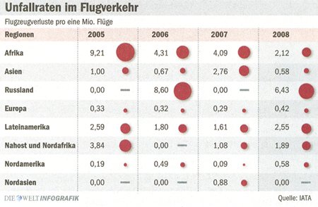
If you look from left to right, you can easily compare total losses over the years. From top to bottom, you can see the contrast among different regions. And if you read the table crosswise, you can quickly assess all these different factors together.
In our observation, there are two important things to consider. How do the regions compare each year? How have the values developed over the years? In other words, we want to compare the values in two different directions – and circles do a pretty good job of that.
Let’s take a look at the other alternatives. The chart below shows the same data as a graphical table using bars instead of circles. Although the vertical comparison is easier, the horizontal one is more difficult. We also want to sort the data, in this example, based on the average per region.
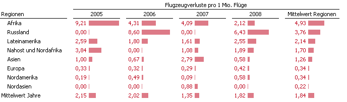
Not much better: The same data replacing circles with bars and sorted by the average.
Another option would be to replace the bars with columns. That way, it would be easier to compare the years.
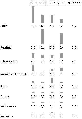
Not better: Replacing bars with columns
I don’t particularly like that alternative. Columns often cause problems because they require a lot of vertical space while the explanatory text extends horizontally. That quickly results in an information scarce layout which eats up a lot of valuable space.
Sparklines don’t due justice either in this case. The values are too extreme and one row ends with zero. That makes the chart very difficult to read.
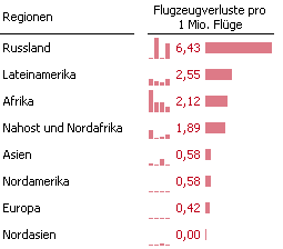
Sparklines are not compelling for once. The data doesn’t allow it.
As a last try, let’s use a common alternative: superimposed time series charts. As usual, they don’t work well either. Since it’s hard to do decent labeling, it ends up looking like a jumbled pile of jackstraws.
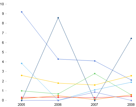
Jackstraws instead of data
By comparing our options, we can clearly see that circles bravely acquit themselves on that matter. Who would have guessed?
