Graphical tables are just amazing. They combine the advantages of tables and charts while avoiding their disadvantages to revolutionize the way we create management reports. In fact, they even entice managers to sit back, take a deep breath and a few minutes to examine them thoroughly – with or without their feet up.
Last week I advocated the concept of “lean” reporting – management reports that can be published without manual editing to streamline production to industrial-like standards. Today, I am going to explain how this works.
Column charts are a typical standard in business reports. But why? We write horizontally and columns run vertically. As a result, the presentation is obese but the content suffers from anorexia. Headlines are constantly broken up and numbers either overlap or appear to be samba dancing off the ends of the columns.
Most column charts can be easily replaced by bar graphs. In this case, the bars should not be higher than the font size and wider than a normal cell. This way, we can integrate text, numbers and graphics in a compact, information-dense table. (Those who are really talented can achieve this with columns as Bella recently reported.)
The strengths of graphical tables are really apparent when time comes into play. This is when normal tables and business charts quickly reach their limitations in presentation. Let’s assume that we want to present budget and actual margin figures as well as their absolute and relative variance for the past twelve months. Displayed in tables, this information would fill four normal pages of paper.

Hard to handle: Displaying actual and budget margin figures and their absolute and relative variance is often too much for tables.
That is too hard to handle. If we are trying to capture fluctuations, highs and lows over a period of time, the reader quickly gets caught in the details and loses sight of what is important. Business charts are not much better:
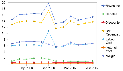
Labels and scales of typical business charts quickly reach their limits.
Although the chart above only displays the actuals column, we have already lost the battle. We need major decoding to understand the meaning of every single line. Our eyes flip back and forth. Some may even find it hard to quickly identify the different colors. Even the scale is poor; it is almost impossible to track the development of items with a smaller range.
It is amazing how easily we can solve this problem with the help of sparklines and bars integrated into a table. Even when we limit ourselves to a relatively small cell width, we can still come very close to transporting the full content of the data.
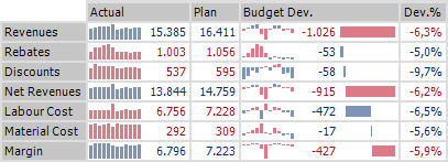
Hard to believe: The full content of a four-page table can fit in a width of less than 450 pixels
The exact values of past periods only interest us on occasion. It is much more important to be able to measure the meaning of current values based on past developments. The compact sparkline format is ideal for putting this into practice. We can create individual scales per cell so that we can also assess the development of smaller items. The size is determined by the current value (i.e. the last one).
The information in the center – the absolute budget deviation – is displayed in a waterfall chart. It shows how the individual items affect gross margin.
Compared to traditional presentation methods, graphical tables visualize information with incredible density. We can reduce thick stacks of reports to just one or two pages so we can make countless comparisons all within eye’s sight. They almost lure our readers to sit back, take a deep breath and a few minutes to examine them thoroughly – with or without their feet up.
