William Playfair invented the pie chart 207 years ago. That is a little too stale for my taste – in most cases at least. Although experts hate them, they are prevalent like no other chart type. But why?
Let’s get right to the point. Pie charts are a telltale sign of a graphical novice. As I will show, pie chart fans can easily get tangled up in one big mess. And only a beginner would risk the embarrassment … albeit unwillingly.
Triviality and poor workmanship shimmer through most pie charts. The example below shows when a pie goes stale:
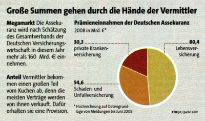
Stale goods: It’s not toxic, but then again it’s not exactly food for thought. (Financial Times Deutschland from 21.11.2008, p. A4)
The chart above presents trivial facts in a trivial manner. Since there are no percentages, the readers have to either calculate them or guess for themselves. Often times, ambitious visualizations and poor content go hand in hand. The headline and body text suggest that insurance agents get ‘the biggest chunk of the pie’. The chart, however, contains no information to prove this point and simply shows the 2008 premiums for different types of insurances. And if you take a look at the quoted source on page 8 out of curiosity, you will only find information about insurance premiums – and nothing on insurance commissions.
Another snag is its appearance of completeness. After all, if we want to demonstrate that we are showing something in its entirety, there is no better way to do that than with a pie chart. If we think about it more closely, however, we can rarely identify the entirety. Therefore, we can only show the distribution across a more-or-less random section.
The next example is even worse because it uses a recipe for time structure pie charts that is really hard to swallow. Whoever tries to understand this botch job soon understands why skeptics say that the only thing worse than a pie chart is several of them.
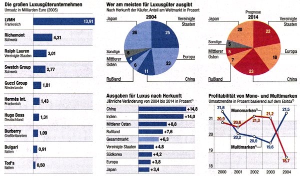 FAZ from 29.7.2006, p. V30. Click to enlarge.
Our eyes have to frantically jump back and forth in order to understand the entire story. That’s a lot of work for a few vague forecasts that don’t mean much anymore in the days of falling oil prices, impoverishing Russian billionaires and a looming financial crisis. But why bother when it could be so simple?
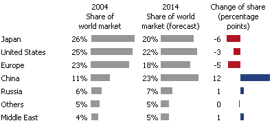
Spending on luxury goods: Presentation of the FAZ data as a graphical table.
Trying to digest a roast goose and so many pies is too much for me right now. Let’s explore that topic in more detail after the New Year!
