When we travel somewhere, we also want to find our way back home. Proper orientation and path finding are important. On a recent trip to New Zealand, when you are about as far away from home as possible, I realized that it’s still very easy to find your orientation. That’s because it’s based on strong visual standards.
In management reports and business magazines, we often encounter visual metaphors which stem from road or traffic signs. When we see these old, familiar signs in their original ‘habitats’, however, we can learn a lot from them. Here are some examples:
Robust perception: Triangles show the direction. Plus and minus signs show changes.
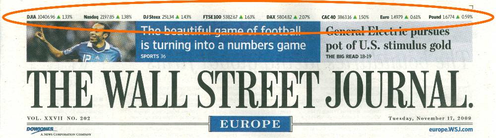
We recently discussed the redesign of the Wall Street Journal. For the past few weeks, the journal has applied a new coding for plus and minus signs: little red and green triangles which show how indexes and currencies have changed compared to the previous day. These triangles appear at the top corner of two different pages and either point up or down.
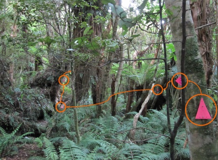
I recently encountered similar triangles while hiking through the forests of New Zealand. A trail, which left the main path and headed into a dense, tropical jungle, was marked by plastic triangles that hung vertically every few meters. These signs were more than just helpful. They were essential because a person could easily get lost after the first few steps in this labyrinth.
If someone had just nailed plus and minus signs on the trees, finding the right path wouldn’t be any easier. In fact, hikers might get so caught up wondering what their purpose was that they literally might not be able to see the wood for the trees.
The triangles, which were long and steep, sometimes pointed right or left and sometimes up or down. Depending on the perspective of the approaching hiker, the same symbol was cleverly displayed in many different ways so that relatively few triangles were needed to clearly mark the challenging off-road path. The color of the triangles stood out because it was not otherwise found in the forest. That, too, was a major help. Two triangles turned towards each other also signalled the stop points for counting offspring, which was the actual purpose of this trail. They showed the hikers that they had reached their destination; the path didn’t go any further.
Robust colors: Forms. Robust form: Colors.
Permanent right-of-way laws can dramatically improve the general safety before one-lane bridges, tunnels and other tight areas. The earlier the driver knows which side has the right of way, the better. The ability to differentiate colors and forms from increasingly larger distances, however, changes in various ways. In most cases, the human eye can differentiate forms for a longer time – especially when individual limitations in vision also come into play.
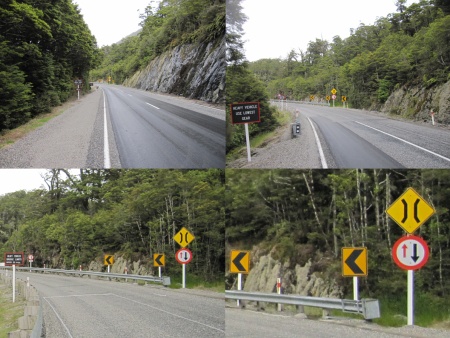
This sign is quickly identified from afar – even with red-green color blindness. Whoever is travelling in the same direction as the large arrow has the right of way. The differentiation between red and black makes the message even more noticeable.
When presenting information on a computer screen or printout, we need to overcome a similar situation. We can easily lose finer color nuances in two separate LCD displays, which have very low color certainty. Plus, we will oversee even larger differences in colors, at the very latest, when making black and white printouts. A robust design takes these circumstances into account.
Robust perspectives: Doubling
On a very curvy street in the mountains, a summit can hide a warning sign if it is mounted at a standardized height. One way to solve this problem is to ‘double up’, in other words, mount the same sign at different heights. The driver can see the higher sign at the ‘usual’ height before the summit and the lower one afterwards. Upon approaching it, the seemingly redundant design surely brings a smile to the faces of design-sensitive souls.
We often face similar situations with management information. The same data deserves the readers’ attention from completely different perspectives. A single visualization rarely can provide such robust perspectives. Therefore, it always pays to ask if we shouldn’t display the same data in multiple variations. What may appear redundant at first is probably the safer alternative when navigating through the twists and turns of your data landscapes.
Each of these examples was a sign to me as well. Symbols are designed to reduce insecurities and these do it adequately. We can learn a lot from their construction but we can’t apply much from their imagery without the risk of oversimplifying or even manipulating our data. How a share price changes compared to the previous day is no real guide through the modern investment jungle. And a traffic light signal cannot determine if standing still or moving forward will improve the situation.
