The poor print media – their circulation is falling and advertisers are pinching their pennies. It’s not just Rupert Murdoch who wants to earn money with his newspapers. In these desperate times, the media could try something radical – such as new formats that exploit the superior resolution of paper. The online media would certainly gawk behind their monitors.
The Wall Street Journal Europe, which has been on the market since 1983, underwent a relaunch on November 17th, 2009. Its American parent company, the Wall Street Journal, often targeted the publication not to bankers but to their customers for a large portion of its 120-year history. Accordingly, it already got a facelift back in early 2007. One column was omitted and some content was moved to the online version. All this happened before Rupert Murdoch took over the helm on August 1st, 2007 and began to make the time-honored business and financial publication a ‘complete’ newspaper by adding sections on politics and culture.
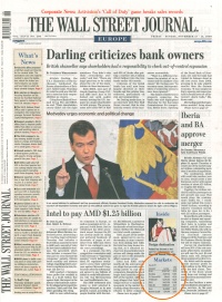
Hold on to the little table on your left. It is the last of its kind and could increase in value someday. As of November 17th, 2009 it became history and was replaced with a ticker that doesn’t even tick. (Title pages of the WSJ Europe from November 13th and 17th, 2009)
The number of relaunches is growing steadily. Every time, we hear about the great concern over the demise of our information culture. In the PR department, these efforts were called ‘investments’ while the finance department called this same procedure ‘cost-cutting’. In fact in the WSJ Europe’s case, the goal was to cut costs by €18 million annually.
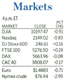
This clear, easy-to-read table filled with facts and figures was second to none. The title page of each WSJ Europe listed the changes of important indicators compared to the previous day – until November 13th, 2009.
The relaunch of the FAZ on January 20th, 2009 was primarily attributed to cost-cutting as well. The stock section was trimmed down by an entire page. Some things disappeared completely while others such as range visualizations were added. How nice – in part because it bears a certain resemblance to one of our own inventions.

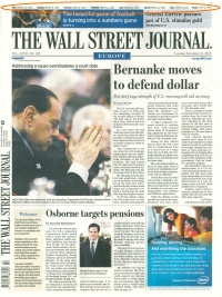
Since November 17th, 2009, WSJ Europe has replaced its front-page table with a ticker that uses triangles instead of algebraic signs.
Let’s go back to the Journal’s facelift. The dozen or so news briefs that graced the left column on the title page moved to page 2 where it now looks anorexic in comparison. The first issue after the relaunch only had room for five little news blips. What a shame…
Fortunately, the well-known standard charts that are drawn in that clean, clear design that I love and I often praise as good examples are still there. Almost. For a long time, I looked forward to seeing that functional table showing the most important index developments on the title page. After all, other publications use the front page to torment their readers with trend arrows where there are no trends to report in the first place.
That beautiful table was replaced with a paper (tiger) ticker – a broad jump for your eyes on the upper corner of the page. Tickers move so that your eyes can stay still – but that doesn’t work on paper. In the first issue every index moved in the same direction. I had to wait for the second issue to be sure – and my instincts were correct. Rupert Murdoch did away with pluses and minuses and opted for triangles instead. If the point faces upwards and is green, that is a plus sign. A point that is red and faces downwards is a minus sign.
Oh, Schumpeter…stand by us.
