We should proofread charts just as carefully as we would any normal text. After all, good content deserves a proper format as well. And when we are sloppy with the packaging, it’s our credibility that suffers. This is a plea not only on behalf of those who are sensitive when it comes to language.
On a beautiful autumn weekend, I took a drive through the quaint Wispertal valley. During my trip I came across a road sign that was supposed to attract motorcyclists to a local restaurant. The only problem was that in two words on the sign there were four mistakes – including a horrendous grammatical error. I suffered.

Four mistakes in two words. According to Duden, the ultimate authority for German spelling and grammar, this sign should read “Biker willkommen!”
The German magazine Focus recently reported the growth of the VW Group since its takeover of Porsche. It showed that Skoda, a lower-priced Czech brand of cars generated €8 billion in sales for 62,600 vehicles. One reader noticed, however, that that couldn’t be right. Although Skoda produces cheaper vehicles, it would have generated higher revenues than Porsche – only with fewer cars. Focus admitted that the reader was correct. The numbers were wrong; a zero was dropped by accident. The right number was 626,000 vehicles.
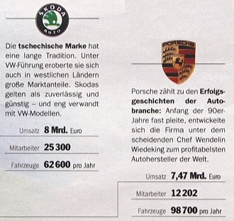
Source: Focus 31/2009, page 25.
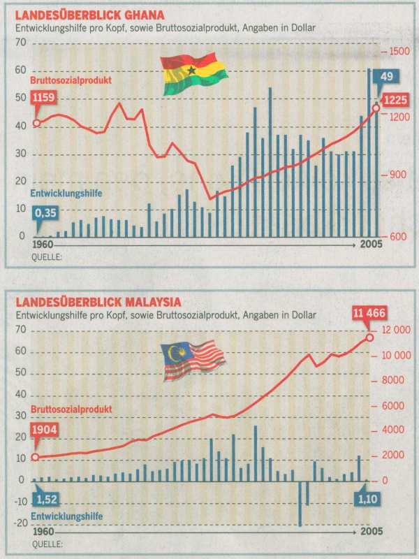
The Sunday edition of the newspaper “Die Welt” recently published two good diagrams regarding foreign aid for Ghana and Malaysia. Unfortunately, there was one small mishap. Someone wrote the word for source (“Quelle”) but forgot to list the source itself.
These are just all examples that someone should and could have prevented if the material were carefully proofread in the first place. Each text, each chart deserves a second glance. After all, wherever small mistakes are lurking, large ones surely are as well. Even the best data visualization will suffer if there are errors in the headline, legend or comments.
Some people may think it’s pedantic to emphasize this but I think it is common courtesy. Conventions make it easier to understand things. Even a pragmatic thug in language issues has to admit that correct and formal language is good marketing for our reports. After all, who should take our message seriously when we were too lazy to read it carefully ourselves?
