When you compress values, you are covering both yourself and your data. Information is rarely so valid and representative that it can maintain its meaning in a summarized form.
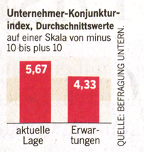
Welt am Sonntag (WAMS), my beloved Sunday newspaper, regularly chats with a panel of top managers. Twelve CEOs assessed what results the current and future economic conditions would have on their companies. Their answers were summarized in a so-called “entrepreneur business cycle index”.
These types of charts are commonplace in articles, presentations, expert reports and memos. The underlying desire to pack information into a single statement is apparent. It’s either black or white – and nothing but the facts.
The desire is understandable but extremely difficult to fulfill. Facts, for example, are rare in today’s information age. The reality is something in a shade of gray – never 100% white or black. Averages signalize precision but our data is usually anything but exact. We need to use averages with caution. Why? Take temperature, for example. The average of zero and 40 degrees Celsius (32 F and 104 F) is a comfortable 20 degrees (68 F). But this moderate temperature never existed. The reality of the uncompressed data was extreme heat and cold. In the case of the twelve lonely CEOs in the WAMS panel, my forecast for my industry would shift the average…upwards. The panel is much too small. As you can see from my fictitious schematic chart, many different distributions (with very different implications) can lead to the average as in the WAMS chart.
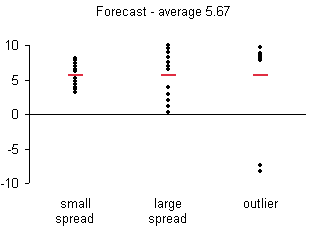
In my opinion, the representation above is the only serious one, because it is transparent. It reveals – not conceals – the information so that each reader can decide if the average is an accurate depiction of the distribution. In addition to viewing the range of the answers, the reader can observe if the distribution shows trends, for example, ten responses are very similar while two are outliers. It illustrates that the data is weak, but it makes the most out of the information available. In other words, it’s beautiful evidence.
If you present your data like this, you not only show that you like the reader but that you like your data as well.
