Together with Rolf Hichert, we have been battling against graphical opulence and anorexic content in reporting since 2007. Recently, we hosted our tenth, joint Advanced Seminar on Industrial Reporting in Nuremberg. That makes it time to reflect on Hichert’s SUCCESS concept and our Industrial Reporting.
It all started with a simple request from Gerhard Wöhrl, a well-known German textiles entrepreneuer. He attended our Executive Forum in Berlin back in November 2007. Rolf Hichert was one of our speakers, and presented his ideas for notation standards in reporting. One of his famous lines is that things that are the same should look the same, and things that are different should look different. Gerhard Wöhrl decided that his members of the board and store managers should hear these ideas as well, and asked if Bissantz and Hichert could condense the content of the Berlin event into a short briefing for his company. When it comes to report design, we share many convictions with Rolf Hichert. We preach against the same sins, and quarrel lightheartedly only over the details. Therefore, we both agreed, and invited other companies as well to our debut event in Nuremberg. That is the story behind our first, joint notation seminar. Since then, we call it our Advanced Seminar on Industrial Reporting.
With Rolf Hichert on the red couch at the Carlton in Nuremberg after our Advanced Seminar on Industrial Reporting on 6 October 2011.
Industrial Reporting – Unify, Condense, Simplify
Supplying senior-level managers and other decision-makers with information and creating reports is a production process. After all, cycle times, quality, capacity, and costs are important benchmarks in reporting as well. Reporting also benefits from the blessings of automation and standards – that is, if we use report formats that can be easily automated and don’t require manual fine tuning. That’s the task of Graphical Tables.
We can see a good example in the following report using “Small Multiples”. This report illustrates many of the advantages that automation and notation can provide.
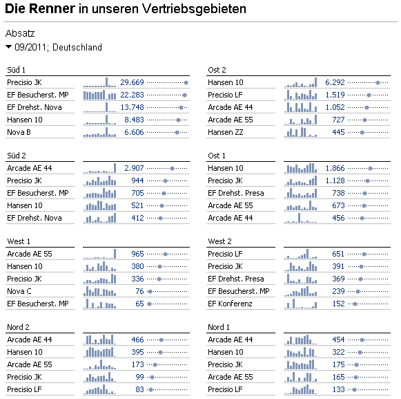
A sample sales analysis report: What are the top five selling products in each sales region? The computer determines the proper notation, scale, and layout automatically. Source: DeltaMaster. Click to enlarge.
You don’t have to worry about formatting or layouts. The format is standardized, and the computer automatically determines the layout based on the amount of space available. The content is data driven and iteratively nests two rankings in one another. That alone is a significant amount of calculation work – but the user doesn’t notice a thing.
Three important components of Hichert’s SUCCESS concept are “Unify” (standardize content), “Condense” (concentrate information) and “Simplify” (avoid complication). Our example above illustrates these concepts in different ways. As you know by now, we feel that when it comes to information density, you can’t have too much of a good thing, which is why sparklines are practically standard in all of our reports. Our color standard has proven its worth for even longer, and uses blue for figures that have a positive effect on the KPI in business scenarios. This deviates from the color that is normally used, which is green. Although we support green as a standard, it is not the default color. Our admittedly thin-skinned interpretation of the signal effect of the color green supports this solution: A weak positive value is not exactly something to cheer about.
Our “Bauhaus” reporting style skimps on every pixel and couldn’t be more minimalistic. But this is just one aspect of what “Simplify” means. Our sample report uses a comparable scale. The same gaps between the dots stand for the same relative differences among values. The scale is calculated by default so the user doesn’t have to deal with that. That, too, is a form of simplification.
Enable
“Enable” is another component of the SUCCESS concept. This means that the company must first put a notation system into practice. In other words, it’s not only important to consider how you can optimize visualization in reports. You also need to embed these concepts throughout the organization. As a software manufacturer, we sometimes view this as a challenge, other times as an advantage. For quite a while now, we have provided formats that deliver high-quality reports without user intervention. So far, we haven’t prevented extra bells and whistles, but it takes time and effort for users to add them. We can set standards by using rules or default values.
Say
Rolf Hichert stresses how important the message is, which is illustrated in the point “Say”. He’s right. Clear messages are absolutely crucial in staff departments, ad hoc or special analyses, quarterly or annual reports, when communicating with shareholders and analysts, taking strategic decisions on investments, divestments, and on the like. But reports can’t always have a customized message – for example, when you need to produce masses of standard reports for hundreds of recipients. The computer, of course, can at least generate simple messages by itself here as well, but these don’t come anywhere close to the level of an experienced controller. We do both. Software can help save and distribute the message. In addition, we allow the computer to automatically interpret things when appropriate.
Check
Rolf Hichert hates manipulated charts just as much as I do. We both collect examples of bad charts and will never tire of getting annoyed at them. Bella’s blog, which is dedicated to identifying and avoiding manipulation, is heading into its sixth year. Our office dog has already posted well over 130 articles, and hasn’t run out of material yet. In the “SUCCESS” concept, this is covered in the point “Check”. Reports shouldn’t just be important; they should also be correct. We are talking about report integrity. Standard formats usually ensure this integrity. In more complicated cases, however, we need algorithms that dynamically suggest the right options based on the data at hand. Very recently, we brought ourselves to be even more consistent with regards to scaling, and will define certain defaults more dogmatically. Rolf and I will certainly have many new topics to quarrel over in that respect.
Before that, I will send a bottle of champagne on its way as my part of our wager. For the past ten seminars, Rolf always complained that our LCD projectors were no good and that he was now going to set up his own one. Each time, I argued that wasn’t possible, the projector was expensive, the latest model, etc. This time, he was right. We should have replaced the light bulb. That makes it 1:0 to Rolf. We’ll face off again in May with a new light bulb.
