Today’s topic is a practical self-help lesson. It is safer to fly than to visualize the safety of flying. Colors have a lot to do with that. What can we learn from this? We don’t have to color everything.
Professor Ed Galea, who teaches fire safety and mathematical modeling in London, investigated the risks of flying. He says that life-threatening plane crashes are extremely rare, crashes with fatalities are even rarer, and crashes without survivors are even rarer than that. Where you sit plays a certain role.
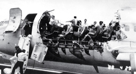
Flying is pretty safe. This machine arrived without its roof – but it still arrived. (Source: AP/Wide World Photos, Aloha Flight 243, 1998-04-28)
The following graphic wants to say exactly that. Instead, it just makes business and first-class passengers sick to their stomachs. Of course, the three-color logic exaggerates; the differences between the numbers aren’t as great as the colors suggest. And no one would die as easily as the graphic implies either. According to Professor Galea, the role of the assigned seat depends on the type of the accident. And then again, the distance to the next exit is more important.
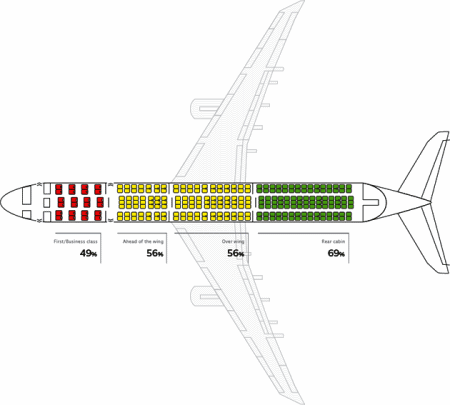
Poor design and a vague message: In this chart, the differences in color are much greater than the differences in numbers. And in reality, of course, everything is a little more complicated than in this drawing. (Source: Gil Ahn/seatguru.com, Survival rates on seat levels of all commercial plane accidents in the USA since 1971)
The next illustration attempts a bit more differentiation. It is so confusing, however, that you probably won’t want to sit next to its author in case of an emergency. In addition, the data in these first two graphics seem to contradict themselves. You would probably be aggravated that you just traded your business-class ticket for economy. This graphic varies in two aspects: both the colors and column heights change. However, it seems that the color in each row remains identical and independent from the column height. It is hard to imagine what the source data looked like.
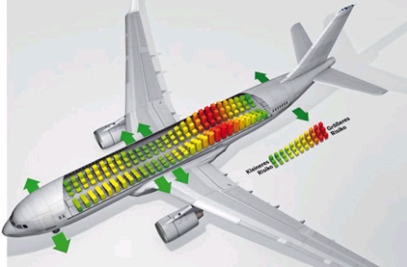
What do different heights in the same color mean? (Source: BILD am Sonntag (BamS), 2008-08-24, „Wissenschaftler klären Frage – Fliegt man vorn sicherer als hinten? [Scientists explain – is flying safer in the back?])
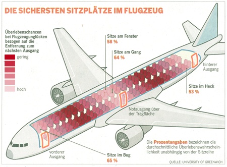
The third chart takes a similar approach and appears to combine the data from the first two charts. Overall, however, it is even more confusing. The risk by location (aisle, window, bow and tail) is listed in percent. The risk based on the distance to the exit is in color. At my next check-in, I am going to demand an aisle seat – up front, light green. I hope that they’ll still let me on board.
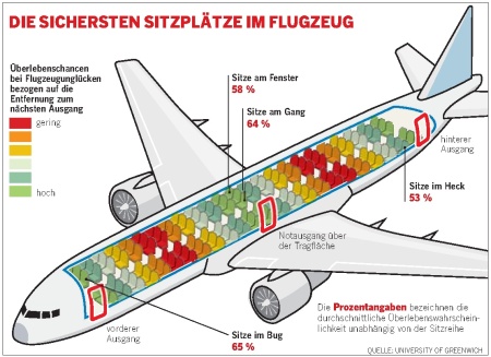
Colors and percentages stand for different data. (Source: WAMS, Nr. 9, 2009-03-01, p. 76)
A small improvement would be to get rid of the traffic light colors, which we have criticized here on more than one occasion. The most important argument is that the human eye cannot intuitively sort red, green and yellow colors in a natural order. That works much better with shades of gray or another single color as our redesign below shows.
An attempt from our side – but it, too, has its limits.
The problem is, however, that you cannot use a single color to visualize any number of different levels. Differentiation is lost. In most cases, five levels are the limit. The darker the tone is, the harder it is to differentiate it. In our redesign example above, you can easily see that in the color scale. The so-called ‘edge fluting’ makes the whole thing even more difficult. Imagined color differences occur on uncontrolled color transitions which need to be suppressed on the borders with additional color changes.
For many types of data, it’s important to be able to differentiate between positive and negative values. This, of course, limits the use of a gray scale which is very helpful when printing hard copies. In our DeltaMaster software, we generally manage this with two-color scales: different shades of blue for positive values and red for negative ones. In this case, however, there are still difficulties with print-outs.
These examples show just a part of the problem. Over all, I think that no visualization can treat this topic fairly. You can quickly see how thin and inaccessible the necessary data are when you try to look for sources. All of the graphics suggest, however, that a person can differentiate the already relatively low risk. That’s nonsense. What we have learned is that it’s better not to draw anything if you can’t produce anything reliable and legible in the process.
In the process, we have almost nearly forgotten the dangers of flying. That’s good because there aren’t many. Our security depends on our own actions. Wear flat shoes. Know where the exits are. Inflate your swim vests outside of the aircraft. And before the crash, lean forward and protect your head. Have a safe trip!
