The graphic is bad: to understand it, I had to read the whole article. The article though was good: car companies are banks. They give money to the car drivers. The car drivers buy cars with the money. The car companies don’t have the money either. They borrow the money from real banks. The real banks want money for the money. From some car companies a lot of money. From other car companies less money. If S&P says A three times, then less money. If S&P says B three times, then more money. The A’s then can give a cheaper credit to the car drivers. The car drivers like that and buy more cars from the A‘s.
Have a look.
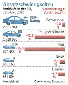
Source: Handelsblatt, 2012-11-20, page 28.
Why is it so hard to understand the graphic? Because it is not ordered by rating. Because rating is blue and so are the cars. Because the car size doesn’t mean rating, but sales. Because the eye asks: the bigger the blue car, the what are the red bars?
Have a look.
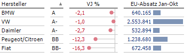
Redesign: me.
Now it works. Why? Because: correlation only shows with order.