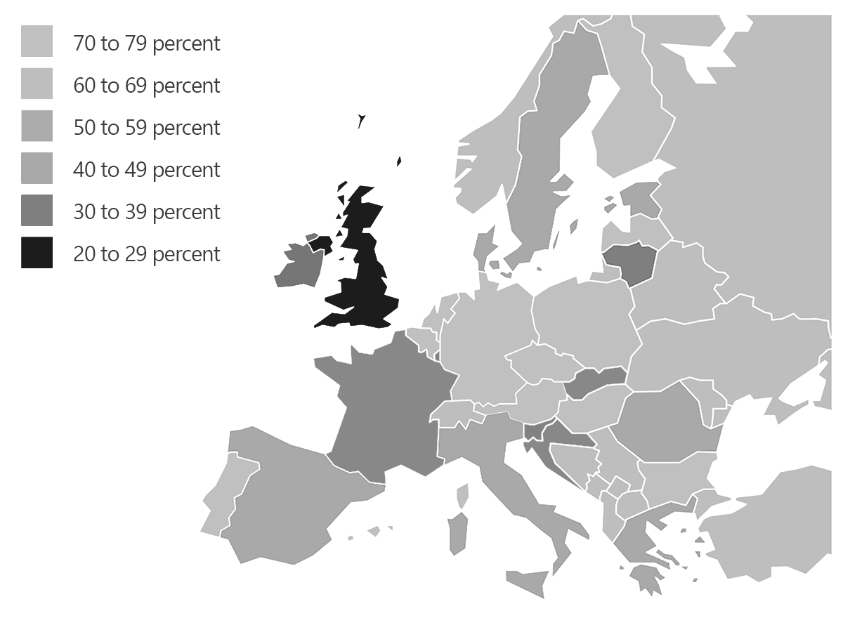
Do you master color scales in reports? Test your knowledge on colors and the right way to convey numbers.
Your supervisory board wants a report on the stance in Europe toward the free trade agreement TTIP. You have used a map of Europe to visualize the percentages of supporters by country. Which color scale would you choose?
a) I use traffic-light colors with red for the countries with the most opponents, yellow for the mid-range values, and green for the most supporters.

b) I use different intensities of red. The less support, the darker the red.

c) I use different intensities of blue. The more support, the darker the blue.

Psst! Please keep your answer to yourself. Send me an email and I will send you the correct answer along with the latest research findings on using colors in management reporting.

