Why management reports need more information density and dashboards are based on a misunderstanding.
If you are a sports fan, the first thing you probably do each morning after grabbing a cup of coffee is reach for the sports section of the morning paper. Psychologists even say that one of the easiest ways to fight your daily doldrums is to route for your local team. But as non-native of Nuremberg, I try to be careful. I follow basketball (gasp!) instead of soccer.
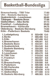
This Monday’s paper shows the results of the German Basketball League (Bundesliga), including the scores from the 6 games of the weekend as well as overall ranking of the 18 teams in the league. That’s a total of 108 numbers on an 8th of a regular-sized page.

Nürnberger Nachrichten, October 30, 2006.
Lost again! Since the SELLBYTEL Baskets Nuremberg still haven’t won a single game this season (as of October 30, 2006), I begin to second guess that psycho babble on happiness and seek comfort in the stock listings of the business section. Wow! Here I can read over 1000 values on a single normal page!
Less is not more. Less is a bore.
For most managers, that would be the apex of information density for the rest of the day. Since most management information systems now look like speedometers, a typical business report only contains 50 numbers per page. That’s only 6% of the information density of my basketball results!
The reason these controls look as they do has a good reason. In contrast to automobile drivers, managers don’t look out the window to drive their companies. They have much more time to study a compact, compelling report.
Understanding is comparing
But to really be compelling, a report needs to make comparisons. However, it can only do that, if it presents all the necessary data on a single page. So-called dashboards meet a manager’s request for compact information by omitting most data instead of compressing it. That’s nonsense!
Maximizing the data-to-ink ratio
3D views, multiple colors, and naively simplified charts have no place in good reporting. Good report design follows simple principles religiously and integrates refined techniques such as sparklines, graphic tables, warning signals without setting parameters and automatic trend detection.
