Many round dashboard controls are good for the (male) ego – at least when it comes to driving cars. Driving business performance, however, is a different story.
Round dashboard controls are very valuable when the indicator signalizes something significant in its upright position. This is the case, for example, when the gauge shows the optimal speed to switch gears or a normal oil temperature.
In airplanes and race cars, many pilots position all of their controls in the chassis to achieve just that. This way, they can see at a glance if all operations are running smoothly. When it comes to observing exact values such as current speed before the start of a curve, however, digital displays are used. Round controls are not suitable. Even Walter Röhrl says so.
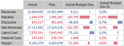
Bars instead of gauges: Each bar’s length represents the indicator’s variance from the upright position.
These best practices also apply for designing management information. Bars are used to illustrate variances. Positive variances are placed to the right, while negative ones are placed to the left. The center line represents all values with a variance of zero, or the upright position of an indicator in a round control.
In management dashboards, tachometers waste space, are difficult to read – and quite frankly, look ludicrous.
