If you are a fan of graphical visualizations, this blog will probably be hard to digest. As much as we love them, charts are actually dangerous communication tools if you take a good look at them. Why? Because our stone-aged instincts usually misinterpret them.
Let’s assume that we want to climb a mountain. Before our journey, we study its profile. If the slope remains constant, we calculate that our assent will be constantly difficult and strenuous. Experience shows that our intuition is usually correct. I assume that this ability is an instinct that dates back to the Stone Ages. Hunting and gathering food, escaping danger, or spotting optimal rest areas all required that people could assess paths accurately. And indeed, we are very good at interpreting upward and downward slopes in analog and, therefore, absolute form.

The silhouette of Mont Vinaigre in Southern France. Time series often look similar but they are not. Is that why there are so many misunderstandings?
Charts are often based on analogies to real-world objects. Take line charts, for example. Line charts – especially when displayed as area charts – often look like a mountain summit. Let’s take a look why that misconception is so fatal.
Let’s assume that we are looking at a time series with 24 periods. In the first ten periods, each value increases by ten units apiece. It then drops once by twenty units. Afterwards, each value drops by 5 units a total of 13 times. That looks like this:
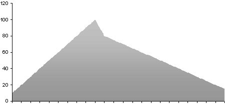
A time series or a foothill of Mont Vinaigre?
A mountain climber will clearly see that the ascent is constant. The first step is just as steep as the last. A business professional, however, is more careful. He rarely focuses on absolute changes in time series. Linear scales have a constant upward slope when relative increases decline or performance drops. A logarithmic scale quickly sheds light on that:
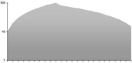
Logarithmic visualization of the same data.
Logarithmic scales are not common. As a result, most readers of daily newspapers or managers who analyze reports are on their own when it comes to avoiding misinterpretations. I personally believe that our brains are so molded by stone-aged instincts that they can’t read the linear chart above like the logarithmic one below it. We follow the ascent with undying optimism – and can’t see the warning signs behind the drop in growth. Linear axes don’t give early warning signals.
Let’s climb another mountain – but this time, let’s choose the one in the second chart. Now, our stone-aged instincts help us feel with each step that our ascent won’t take much longer. And sometime later, the decent will get steeper and steeper. Therefore, managers who want to understand their data landscapes have to hike them in logarithmic boots.
