We didn’t get around to this last year but are now delivering as promised. The second part of our year in review shows the things that annoyed us the most in 2010.
-
Marketing still manages occasionally to win against controlling when it comes to painting numbers or their visualizations in corporate colors. Sometimes that looks just clumsy. Other times, it looks plain ridiculous. Some companies, for example, color their numbers red – even when they are way in the black – just so to match their logo in annual reports or investor information sheets. We’ve witnessed that in publications from E.ON, Sparkasse banks and Vodafone. Our clear #1.
-
The German newspaper FAZ revamped its stock section on 19 January 2009. Some things were removed; others were added. One of the new features is a visualization showing the index development of important stock markets over the past 24 hours. That is interesting because we should be able to see if the market sentiment in Frankfurt appears to be contagious in Tokyo and Hong Kong or if the mood in New York is spreading in Frankfurt. But this is only possible in theory because FAZ norms the starting point of each time series with the opening quote of the index – not the previous day’s close as you would think. This visualization, therefore, loses its charm. We informed the editors at FAZ about our concern back in June 2009. Due to their reaction and the fact that nothing improved in 2010, the publication has rightfully earned our inglorious #2 ranking.
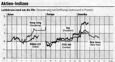
Stocks around the clock: breakbeats instead of rock and roll. Source: FAZ, 2009-09-25. -
Germany’s Süddeutsche Zeitung (SZ) has made us yearn for good visualization even longer than FAZ. This newspaper has commendably added bars to its stock section to create a graphical table so that you can read this section faster. But SZ chops off all price developments exceeding 5%. We counted in the first half of 2010. On average, there were changes larger than 5% every third day. #3.
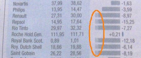
Stock price changes from the previous day in Süddeutsche Zeitung – here from 2008-10-23. Plus: It is a graphical table. Minus: The bars only show changes up to 5%. -
Scientific journals are known to be strict with their authors. How they visualize their data, however, doesn’t seem to be a regular criterion. Bella and a commentator on her blog criticized an example that was even supposed to deal with visualization but committed a major sin itself.
-
In our opinion, the worst infographics out there are in the German newspaper Die Zeit. The newspaper’s articles, however, aren’t near as bad. The following graphic, which stems from 2009 and was part of a series that continued in 2010, shows us how a newspaper is made. It deserves #5.
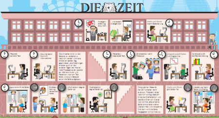
Source: Die Zeit, 2009-10-29, page 37; click here to view. -
Somewhat surprisingly, the newest 2010 version of Excel has also earned a spot on our list – without us even having to have had to search for new sin. A very old and particularly horrible feature has made it safely into this update as well: When values lie close together, the chart wizard automatically chops off the bottoms of the columns and bars. That, of course, makes the entire visualization absurd because the differences in length are no longer proportional to the differences in the values.
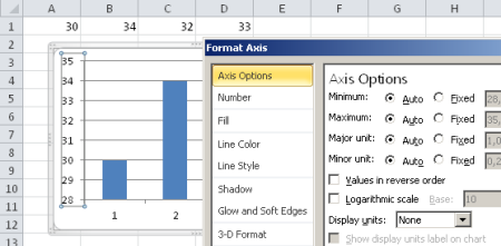
In Excel 2010 automatic axis scaling means again: chopping. -
After the financial crisis, we optimistically expected that all types of signals that reduce complex, multidimensional concepts such as risks and creditworthiness into a single, trivial value would soon be eradicated. Instead, our beloved Wall Street Journal has removed its usual index table from the title page – and now uses red and green triangles in place of mathematical signs and prints the changes of the most important financial indications across the top of the page in a way that is hard to compare.

Our consolation: If you want to see how succinct language can be, take a closer look at the Journal’s headlines. Even the New York Times doesn’t come close in comparison and among German newspapers, the only publication that is able to produce a decent headline every once in a while is the otherwise ruthless BILD tabloid.
-
Many online portals now contain picture shows that really get on our nerves. A story that we would like to observe as a whole is chopped down into little pieces; large images replace linguistic reporting that is rich in nuances. #8 for staccato info.
-
The speaker list at a Hubert Burda event in Munich was swarming with people from Pixelland. I don’t see why traditional print media should surrender to a medium that doesn’t even understand itself yet. A daily newspaper has a half of a square meter space per double page to do great things. I have spoken with many editors from major German publications: Everywhere you feel this great fear to develop the medium further. They are so fixated on their most feared competitor Internet, that many can’t see the potential of their own medium. #9 for the self-determined demise of paper.
-
The worst of all new ‘infotainment’ formats is a huge number followed by a significantly smaller text which presents this number as a completely random statistic. For instance we learn that 8 is the number of Inter Mailand soccer players that were picked up in a seedy bar the day before they won a major game – or something to the like.
Before we close our review of 2010, let’s evaluate that these top and flop lists themselves are self-appraised: The list format rouses curiosity and reads well, too. But it also suggests objectivity and order where in reality there is just randomness and arbitrariness. In 2011, we will experience more highs and lows in our information culture. Let’s see what awaits us.
The first part of our year in review: here.
