Our August post on a botched-up scale in a “Spiegel” graphic has made some waves. A magazine for infographic designers picked up on our arguments and dedicated a two-page spread to the topic – with a certain finesse that you could even apply to management reporting.
At the end of October, we took part in “Push, Pop, Press: Interactive Infographics in the Focus of Research”, a symposium hosted by Stuttgart Media University and organized and moderated by three of its professors – Michael Burmester, Ralph Tille, and Wibke Weber. Among the participants were graphic designers, a cartographer, researchers on the topic of interactive infographics as well as representatives from dpa, Spiegel online, ZDF, and Springer.
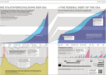
Jan Schwochow created this A3-sized infographic based on our two posts on the lopsided scale in a Spiegel chart. Source: IN GRAPHICS Vol. 3, Berlin 2011, pp. 26-27.
We explained what had bothered us about the Spiegel chart showing the U.S. federal debt and why we think that people should draw logarithmic charts and not linear ones. Jan Schwochow liked our arguments and invited us to recap them in his bilingual magazine IN GRAPHICS. We, of course, know his magazine and were shocked. We immediately thought of our recent post that mentions Wolf Schneider, who hosts writing-improvement seminars and warns his audience that they are writing “about moderately interesting topics for moderately interested readers”. That, of course, doesn’t apply to us. In financial controlling, we write for managers who anxiously await our latest reports. In an IN GRAPHICS article, however, we would be speaking to infographic designers by means of an infographic, and about a topic that we would normally discuss in our blog– sometimes at length, sometimes with a lot of text, and ideally with lots of links.
We graciously turned down his offer and asked Jan Schwochow what kind of story he would make out of our two posts on the topic. A few days later, he sent us a first draft that left us speechless. We made a few edits and debated if and how we wanted to explain how a logarithmic scale works. We did – like this:
“Logarithmic scales are labeled e.g. 2, 20, 200 or 5, 50, 500. Drawn, however, their logarithms are – 0.3, 1.3, 2.3 and 0.7, 1.7, 2.7. Look at the decimal places. They are identical for 2, 20, 200 etc. So are the geometric distances between e.g. 20 and 30 or 200 and 300.”
A few more days later, we sat together to review the final results. Take a closer look yourself. It contains wonderful graphical finesses. Tapering and broadening strips illustrate just how randomly linear lines are squashed and stretched (upper part of the double page).
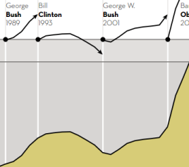 By extracting different sections of the line, you can see the dynamics of different time periods. These sections are graphically normalized, they all start from the same base line.
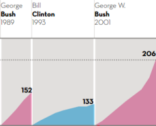 As a refreshing change, the normalized time series are also placed one after another – and not simply on top of each other as is common practice.
We will have to take a closer look to see if these finesses are practical in management reporting. For the time being, however, we can say for the record that the media are becoming more logarithmic. And if you still don’t think you can use logarithms in your company, simply place a copy of IN GRAPHICS – strategically opened to page 26, of course – on the desks of your executives.
