Management salaries are a hot topic nowadays. The usual “evidence”, however, is either manipulated in one direction or the other. Good information design can help make the discussion more objective. The New York Times shows how.
Complaining is easy. And there are more examples for poor information design than we really would care to admit. Perhaps that makes it all the more exciting to unexpectedly discover “beautiful evidence” as in this recent edition of The New York Times.
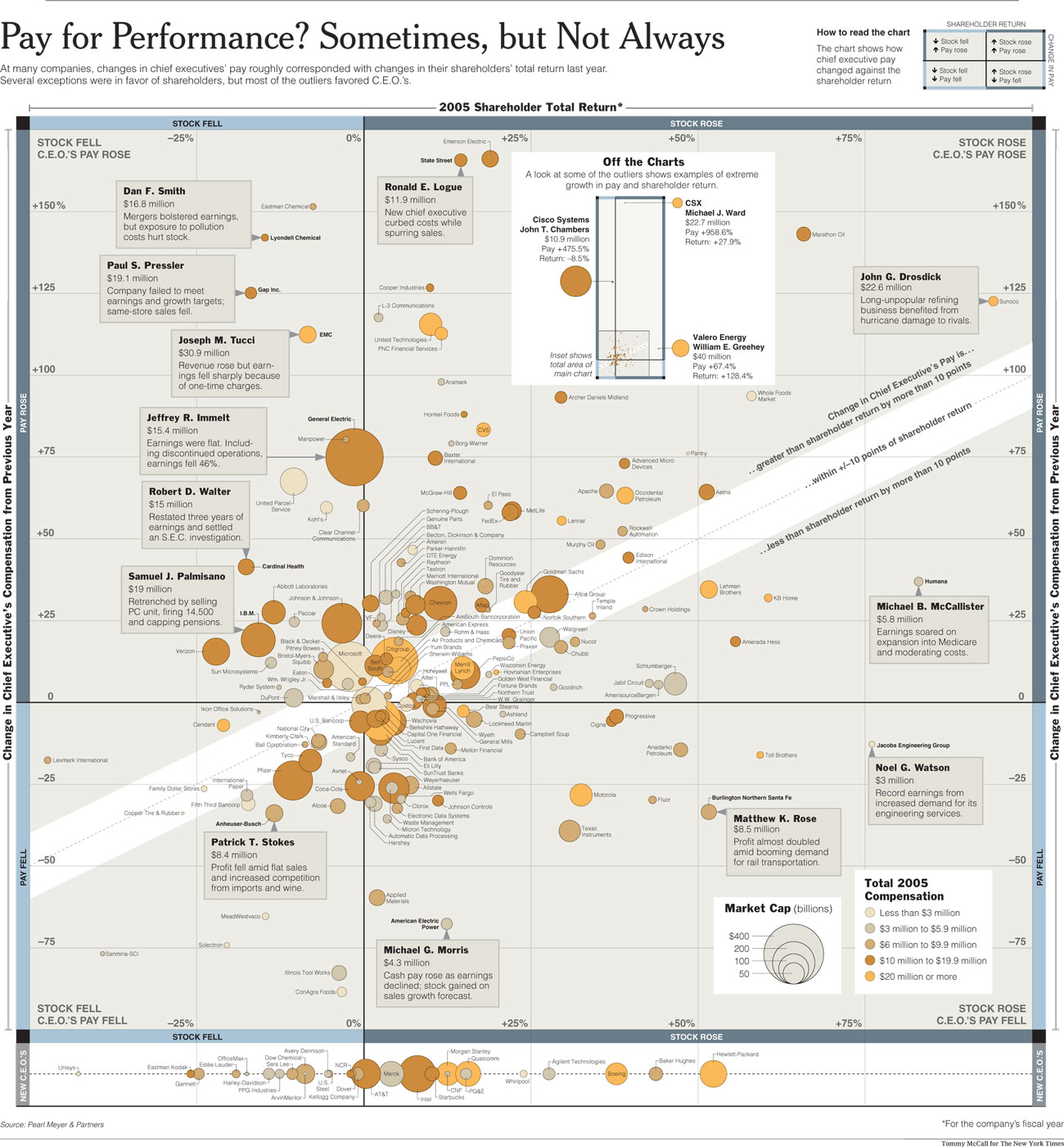
Except from The New York Times. Click on the image to enlarge.
It is no coincidence that Edward Tufte chose this very title for his latest book. “Beauty” in this sense has little to do with mere aesthetics. It is provoked by the joy of learning, because everything we need to understand the context is presented in accordance with the eight commandments of good visualization. As humans, we can never outgrow our innate joy of learning. Otherwise, our evolution would be unexplainable.
This chart in The New York Times studies the relationship between stock price development and the salaries of CEO’s in the United States in a way that is data dense and rich in content yet very clear. It combines numbers, charts, graphics and words just as Galileo would have. It rewards intensive examination. It contains many facts to help answer the question, yet maintains neutrality. Just like in real life, it shows that where there is sun, there are also shadows. Some salaries show a logical relationship between business performance and monetary compensation. Other CEO’s are obviously over – or underpaid – at least as far as the stock market price is concerned. Whether that is the best method to be judged by, however, is a difficult story in itself.
Since the question if executives really earn their salaries is not an easy one to answer, the chart offers background information to further explain the outliers. In general, this chart abstains from the judgment of a complex relationship. Using a corridor, it tries to derive a general message while showing its boundaries. The reader is informed…but not influenced.
