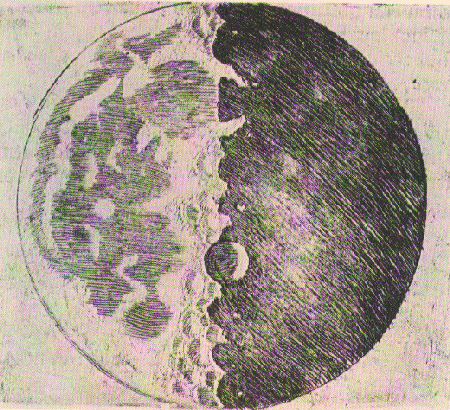
Galileo Galilei discovered geometry and eventually mathematics through art. Lodovico Cigoli, a friend and fellow painter, once compared him to Michelangelo. Galileo’s drawing of the moon surface, for example, combines visualization with analysis. He improved the resolution of the telescope from the 9x magnification common in his time to 20x. Galileo first pieced together the captured segments of the moon in his head and later on paper. Through drawings and calculations, he investigated how relationships in height are revealed in light and shadows. These findings flowed into the fine nuances in his presentation of the surface and phases of the moon.
The concept of prioritizing our efforts on the quality of the illustration is still valid 400 years later. Bella has observed an excellent example of an information graphic from Steven Romalewski. ET also refers to beautiful illustrations from Megan Jaegermann.
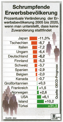
If design elements do not add any additional content, we end up with decoration instead of information graphics. The following example, which shows the declining workforce statistics in various countries, uses so much meaningless garbage, that the human eye automatically jumps from the numbers to the irrelevant dark silhouettes in the background. These design elements are not only totally unnecessary for drawing conclusions, they also obstruct justice to the numbers!