Graphical tables make analysis so much easier. Since they don’t require fine-tuning, you can let them run automatically. And due to new graphic elements, they are emerging as a highly attractive alternative.
Last time, we categorically proved that when you want to visualize the differences among three or more criteria, stacking is not the way to do it. This is important to know when you want to compare components. If you want to show how the price of gasoline as well as the breakdown by base price and tax vary in different countries, for example, the stack would grow too large too fast because you are displaying three separate criteria.
One way to fix this problem would be to create more room – by devoting a separate column to each criterion.
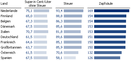
Better than a traditional stacked chart – but not the best solution. (First column “Super …” = base price excluding tax, second column “Steuer” = tax, third column “Zapfsäule” = final price at the pump.)
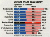
When it comes to bad stacked charts, this one raises the bar. Click here for a complete commentary. Source: “auto motor und sport”, Issue 16/2008, p. 3.
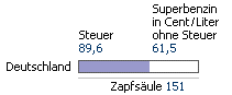
Now that you can compare all of the criteria more effectively, you can see that although Germany has the second highest gasoline tax, the final price at the pump lies in the mid range among Western European countries. Why? Germany ties with Austria for the lowest base price.
Our alternative, however, ignores the actual motivation for using a stacked chart, which is to visualize the breakdown of the final price by the base price and the tax. In our example, the bars for the base price and the tax are located too far from the total price. When three components in the table are too much and one component is not good either, than the truth might be two graphical components. That is the concept behind using a reference bar. Reference bars use a filled chart to illustrate the main and partial components together. Redundancies are tolerated.
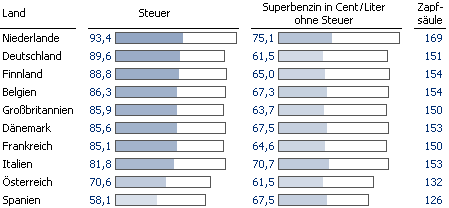
The frame illustrates the total value, the blue fill stands for the actual value and the unfilled part represents the other value in each of the bars above.
Each column now contains a graphical representation of all three criteria; the aspect in focus is highlighted in color. In the first column, we can now even perform a simple regression analysis with nothing more than the naked eye. We can identify a relationship between the ranking by tax and the order by total price.
Once again, this example illustrates what is truly important in an analytical presentation: the comparison. Good graphical presentations and easy comparisons on the eye go hand in hand. First, however, you must decide which factors you want to compare in the first place. Both the original chart and our revised version dedicate each pixel to comparing the components. Next time, however, we will show that it’s not necessary to carve that in bars of stone.
