Stacked charts are nothing but a hoax. They pretend to reveal structures but that rarely works on account of their design. Learn why that is and what alternatives are available.
Stacked charts are commonplace. Their purpose is to pinpoint structures. For example: How are things put together? How did this formation change? Which components are important here…and which ones there?
In the last few weeks, we have heard ample discussion about gasoline prices, which are comprised of many different components. These, in turn, vary from country to country. Those reporting these differences displayed them in this form:
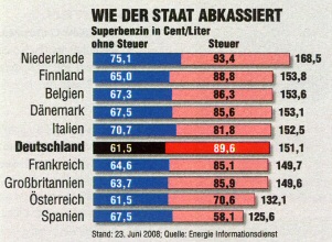
Which country pays the highest taxes per liter of gas? Only the numbers tell the answer. The chart doesn’t help. (auto motor und sport 16/2008, p. 3)
As we can see, the stacking effect only works the way it should within a bar. Here, the human eye can easily differentiate which percentage a given component contributes to the total bar. In addition, we can distinguish the length of a bar that starts from a common base line. We also can identify the differences among the total prices and the base prices. The various tax surcharges, however, are only really visible when we read the numbers. Therefore, if we want to visually differentiate more than two criteria, stacking is not the right choice. In this case, there are three elements: base price, tax and the final price.
The second example shows how many hours a German midsize company needs to file an income tax statement. In this sample, four criteria are visualized. First, we should commend that the chart contained over 76 values, which is very rare. This chart, which came from Focus magazine, clearly had the highest information density of all visualizations in the issue.
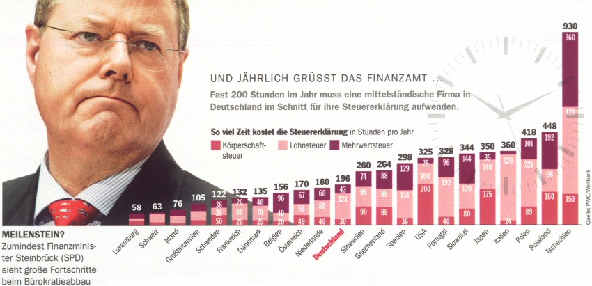
The picture of Germany’s Finance Minister and the clock are unnecessary junk. While the high information density is laudable, the stacked charts are not. (Focus 29/2008, 14.07.2008, p. 27)
Here, too, the chart only works for the first and the total values. For everything else, we need to read the numbers which are close together in this case and, therefore, comparable. One (possibly) surprising fact is that Germany ranks in the mid range of the listed countries. If we wanted to be really picky, however, we could mention that the chart should use bars instead of columns which are actually reserved for time series comparisons.
Stacked charts are aggravating when the segments vary greatly in size and there is no space left for the values. In the chart below, the breakdown of milk prices is simply not clear:
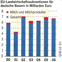
How have milk subsidies changed over time? It’s hard to say because the chart was stacked and there was no room left for the values. (Welt am Sonntag, 05.08.2007, p. 23)
Our conclusion: Do away with stacked charts! Whoever wants to be believable and understandable should stop stacking charts and use a graphical table instead. Bella has already demonstrated how these could be a better alternative to stacked time series. The stacked gas price from “auto motor und sport” magazine could look like this:
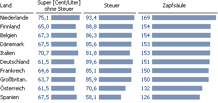
Much better! This chart provides a quick overview and numbers for more detailed interest. Stacking isn’t necessary.
Each criterion gets its own column and has its own clear graphical representation. We don’t have to think about where to place the numbers either.
Next time, I will demonstrate a trick how we can increase the analytical significance of a graphical table. Until then, I am sure that stacked charts will lose their last remaining fans…
