Fans euphemistically call them infographics. Yet all too often, they have little to do with good charts – and contain very little information. I call them “decograms” – and I hope that someday they will be eliminated for good.
Last week we talked about our information culture and discussed how the information that producers supply should echo what consumers demand. And what is my wish as an information consumer? I don’t want to see any more infographics!
dpa, one of the world’s leading international news agencies, uses this sample chart to advertise the services of its subsidiary dpa-infografik. The spiral arrangement and growing coats of arms, however, obstruct the reader from quickly understanding relationships among the numbers.
First the good news: Although you can see them everywhere you look, infographics are no longer the dominant form of graphical presentations. In a random sample taken from Capital, Focus, Financial Times Deutschland (FTD), Neue Zürcher Zeitung (NZZ), Spiegel, Süddeutsche Zeitung and Welt am Sonntag (WAMS), I discovered that Spiegel and Focus use them the most. I only found one instance in Capital – and none in NZZ!
Nevertheless, there are two reasons why we should abolish them entirely. First of all, when people openly present them as a PR instrument as one Austrian agency does, there is little doubt that the underlying motivation is to arouse the reader’s emotions and sell a certain message.
“[Infographics] supply us with an affective entry into the hearts of readers because they emotionalize the message through symbols and easy-to-absorb illustrations. For example: residential construction drops – sad family.”
Translated from www.infografik.at
Thanks, but no thanks. Now at the very latest, we should see the warning signs that every infographic we see could be trying to manipulate us.
Secondly, even when they don’t intend to influence their audience, most infographic designers are convinced that decoration improves readability and understanding. In actuality, however, it just makes things worse. Even when the decorative elements don’t distort the data (which is usually the case), the human eye first has to filter out all of the garbage before it can absorb and compare the actual information. This effect is as simple to understand as it is to ignore. If I were to grade decograms, I would give them major point deductions.
1. The page filler (-10 points deduction)
This is the harmless version of the decogram. The decoration does not distort the numbers. The presentation – not to mention the content – is just trivial. The sample below shows the three health conditions that cause the highest number of sick days in the United States. The three displayed numbers show no past comparisons, historical developments or contrasts with other countries. The tie, title and background for the numbers are all red. This visualization screams: “I look pretty. Otherwise, just ignore me.”
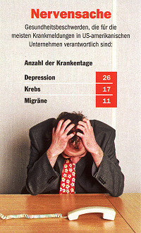 A harmless page-filler chart. It doesn’t hurt and can be ignored without further consequences. Source: Focus, Issue 29/2008, 14.07.2008, p. 106.
2. The botch job (-20 points deduction)
This example, which asked 1000 people if Germany would win the European Soccer Championship, places decoration over information. No one quite knows where the red column should end and the difference in length was spread through the trapezoid form of the trophy’s base. Since the information is so trivial and the actual numbers are clear to read, we’ll just let that one pass as a slip up.
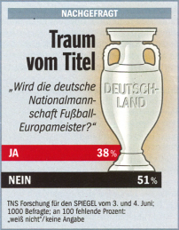 The botch job: If we used a ruler, we could see that the red bar should end at the upper right corner. Source: Der Spiegel, Issue 24/2008, 09.06.2008, p. 18.
3. The obstructed Neurath (-30 points deduction)
Otto Neurath was a pioneer in picture language. Sometimes when people try to present numbers using a pictogram, however, it goes terribly wrong and reader‘s eyes just go back and forth in a desperate attempt to find and understand a few numbers. Spatial representations are always tricky. Stretching flags simply borders on bad taste.
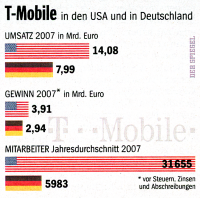
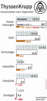
Good symbols are helpful. Poor ones, however, are annoying. Spaces and flags, for example, are taboo because they can be doubly misunderstood. Source: Der Spiegel, Issue 29/2008, 21.07.2008, p. 69 und S. 65.
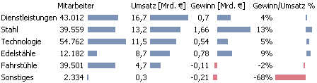
The numbers for Thyssen Krupp could have been presented like this.
…and for T-Mobile as well. What has happened? We want to know the numbers!
4. The counterfeiter (-70 points deduction)
The obstructed Neurath can also be taken up a notch. The chart below, for example, shows how many million bottles of Bionade were sold from 2002 – 2007. Our eyes recognize spaces, which as we know is rather difficult to do, but then makes a mistake in the process. The creator of this chart really wants us to count the bottles. Although the difference between 2006 and 2007 is almost 300 %, the space only doubled in size.
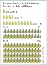
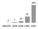
Only those who actually count the bottles will learn something from this chart in Welt am Sonntag (Nr. 26/2008, 29.06.08, p. 34). The impression of space is very deceiving as we can see from Bella’s redesign on the right.
5. The manipulator (-100 points deduction)
Although it looks relatively harmless, the chart below showing the decline of music sales since 2000 is really sneaky when you take a closer look behind the pixels. Although the decorative elements don’t hide or stretch anything, they actually camouflage the cover up. It almost makes you want to send a donation to help the poor music industry. Cutting the axes is an age-old trick. A fair presentation of a 25 % drop would alter the slope of the time series so that the change in height would equal a fourth of that in length. In this case, however, it is almost 100 %. The slope is dramatized. The decisive effect, however, is that the end value lies near the X axis, which based on our visual habits should be close to the base line. The text row containing the source information makes the base line appear even closer. This chart screams that music sales have dropped rock bottom when, in fact, they still cashed in at $30 billion in 2007.
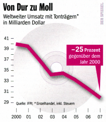 This chart may look harmless but is really a dangerous manipulator in disguise. Source: Der Spiegel, Issue 29/2008, 21.07.08, p. 98.
There are, of course, other samples that show that you can enchant readers with charts without resorting to botches or manipulation. The Sunday edition of the Frankfurter Allgemeine Zeitung uses a simple table to compare the soccer stars Diego and Franck Ribéry. Why not?
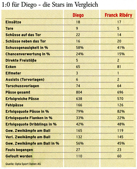
Numbers are exciting when they mean something to us. In this case, their readability determines how quickly we can understand them. Source: Sunday edition of the Frankfurter Allgemeine Zeitung, Issue 6/2008, 10.02.2008, p. 15.
In general, charts are becoming simpler and more authors are focusing their valuable pixels on data and not decoration. Many charts in Capital are very close to my personal ideal of a graphic table. In this case, even the bars aren’t higher than the text.
Free from decoration and other garbage: The message is clear and even the bars have the quality of word graphics. Source: Capital 10/2008, p. 46.
I personally react in one of two ways. I feel that decograms have no place in management reports, annual reports, internal surveys and memos – unless, of course, someone wants to end their career early. In magazines and newspapers, I just crinkle my nose and assume that someone either wants to put one over on me or was just plain sloppy. Usually, I am right.
And if someone asks what a real infographic looks like, I show them this example:
The ideal infographic: Each single pixel contains information. Source: Welt am Sonntag, Nr. 27/2008, 06.07.2008, p. 66.
