Do we really live in an information society? I don’t think so. Information is as rare – and disinformation, lies and overall sloppiness are more rampant – than ever before.
Wherever we look, there are plenty of examples. Some are systematic and approved from the highest of authorities, while others are the result of sheer ignorance or a mere shortage of time. The following random examples illustrate the scope of this problem.

“Hello, Captain Ibrahim”: Evidence (sic!) from Colin Powell’s “Failing to disarm” presentation to the UN
Politically motivated lies
In the meantime, everyone knows that either former US Secretary of State Colin Powell, former CIA director George Tenet or Tenet’s former staff lied – or all three of them did. Powell stood in front of the United Nations on February 5, 2003 and presented 45 PowerPoint slides containing fabricated evidence that Iraq’s dictator Saddam Hussein possessed weapons of mass destruction. Considering the banality of many of these slides, it is surprising that the delegates of the UN Security Council didn’t burst out laughing.
Hasty information designers
In a single issue of “Wirtschaftswoche”, one of Germany’s leading business weeklies, I discovered three examples of time axes that were much too liberal. There cannot be any doubt that in each case the underlying data are much weaker than they appear to be. Besides, if the authors are merely showing two forecast values, is using the conjunctive mood or the future tense too much to ask?
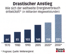
This chart says: “Drastic increase: How global energy consumption is developing”. The chosen time pattern is quite unusual as well: first ten, then 15, then 30 years (Wirtschaftswoche 27/2008, June 30th, 2008, p. 85).
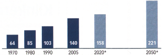
This is how a serious chart would display the four real (albeit incomplete) values and the two forecasted ones over a 42-year time frame.
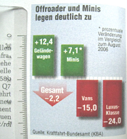
“auto motor und sport”, Issue 20/2007, p. 16
Consumer magazines
Actually, I find horribly distorted charts that chop or squash axes in every magazine that I open. Just by looking at the chart on the right hand side, I can see that the 24% drop in the luxury class (“Luxusklasse”) is almost half the size that it should be, while the increase for compact cars (“Minis”) looks larger than it really is. Not to mention, the arrow is a bit exaggerated.
Charts have clearly missed their target when their graphical elements are not proportional to the presented values. But that doesn’t matter; they still go to print.
There are just as many lies in pictures as in charts. When an automotive magazine presents forthcoming models, they generally forget to mention that the pictures are actually computer images that have fantasy wheels and are wider, lower and, therefore, significantly sleeker than the original will actually be.

Left: This is the 2007 presentation of the new BMW 7 in “auto motor und sport” (Issue 25/2007, p. 27). Right: This is the reality – without the computerized pomp (Issue 14/2008, p. 16).
The enlighteners
Even people who want to clarify the shortcomings in the information culture aren’t afraid to be manipulative. As the German business magazine brand eins wanted to denounce statistical manipulation, it used an example that criticized the Mexican government for celebrating the extension of its highway from four to six lanes and the later reduction back to four as a 17% net increase in capacity. I found this story so interesting that I followed it back the source listed by “brand eins” – a letter to the editor in “The Economist”! The elaborate story that “brand eins” concocted is worth reading:
“The best thing isn’t the verve with which the public official in Mexico – as everywhere, including here – uses numbers to trick, disguise and deceive, but that almost no one noticed the calculated cartwheel. Years after the world believed in the Mexican highway wonder, a reporter from “The Economist” recalculated the figures – and was shocked.” (brand eins 02/04, p. 57, translated)
At first, I assumed that it was simply a long forgotten source. I googled diligently and asked friends in Mexico to do the same in Spanish. Nada! I didn’t find any information on Mexican public officials with verve, a highway miracle, or the world that fell for it.
All of us
Whether small or large, from good or bad sources, information always has a purpose. It exists for a reason. And since we all want to be inspired, entertained, delighted, motivated, supplied and cared for, we accept sugarcoating, fabrication, abbreviation, generalization and exaggeration – both knowingly and unknowingly.
That’s why it makes no sense to attack the producers of disinformation without addressing the consumer demand for it. I personally feel that we must first learn to identify what constitutes disinformation and realize that it is all around us. Then we can go from there.
