“Die Welt” recently made a first attempt to use sparklines. Shrunken graphics with dubious references and problematic scales, however, were the result. Too bad! The good news, however, is that the race for the first sparklines in a German newspaper is still on.
About four weeks ago, a colleague entered my office and announced ecstatically, “’Die Welt’ printed its first sparklines!” He was excited – as was I. With great suspense we bent over to examine the March 16th issue of the German newspaper. The longer we looked, the longer our faces became. Why?
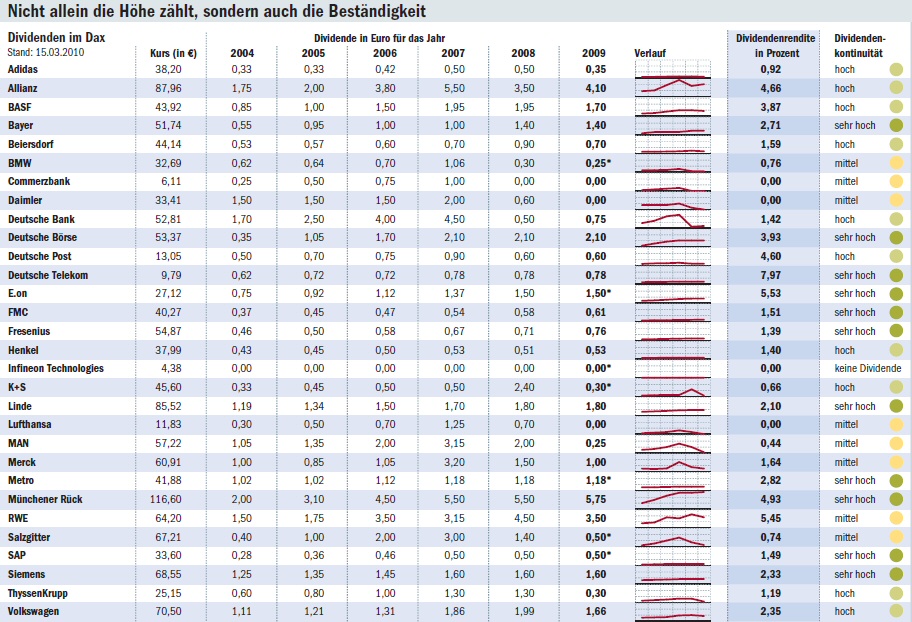
This table shows the March 15, 2010 stock price, the dividends in euros for 2000 – 2009, a time series chart, the dividend yield in percent and the dividend continuity for the thirty DAX companies. Source: Die Welt, March 16, 2010, page 15. – Click to enlarge.
Because:
- When we create a small time series chart, our intention is not to make our readers wish they had a new pair of glasses. If we want to show individual values, we use a table. When we want to examine a development in detail, we use a normal time series chart. If we primarily want to focus on the final (i.e. current) value but also want to show this value in its historical context, we use a sparkline.
“Die Welt” couldn’t make up its mind. We first see the individual values for the absolute dividends followed by the same values drawn as a miniature line chart. Afterwards, we see something really interesting – the yield in percent. We would like to view those historical values as sparklines. Unfortunately, they are missing.
- When we draw a sparkline, we also include a reference value that quantifies the last point of the row. This way, we can compare all previous points to this value to get a general idea how the individual values stand in relation to each other. After all, that is what makes sparklines so fascinating in the first place.
It took me a while to understand which values “Die Welt” was referencing in the rows. At first, I had hoped that it was the dividend yield in percent. In that case, the vertical comparison of the 30 rows would have made sense; a flat row would have symbolized a low yield. We can see the problem with how “Die Welt” visualized the chart. A high relative yield might be hidden in a rather flat line – as it is in the case of the Telekom or Post.
- Since sparklines are so tiny, there’s not much room above, below or next to them. Sparklines are not a quiz. We want to read – not decipher – them. We want to see the pattern in the row and not guess what the individual values are. We want to understand them – not solve a riddle. Every person who has discovered and is fascinated by sparklines wants to add or improve something. Difficult.
At any rate, the help grid doesn’t help at all because we don’t know what the grid intervals mean on two different occasions. And the table’s zebra stripes don’t help much either.
- The gauges make me a little sad. There are people who think that mafia-like mechanisms are the cause of the financial crisis. Ratings that are reduced to allegedly clear signals as they had come from rating agencies are just one example of them.
To the editor of “Die Welt”: What do you mean with continuity? And why is the gauge green if the road was already clear in the past? Does that mean I can just zoom along by? Or should I check if someone or something is approaching from a side street? Whoever drew this chart really overstepped his or her boundaries. We all wanted to be a bit more cautious with our investments, didn’t we?
When we ponder over the table a bit longer, the design isn’t the only thing that gets us thinking. Absolute dividends primarily interest major stockholders who hold onto their shares for a very long time and ignore gains in the stock price because they don’t want to sell them in the first place. Everyone else, however, is interested in the relative dividend yield. That, in turn, depends on which price each individual purchased his or her shares. Every other price only serves as an orientation. Since share prices fluctuate greatly in general, continuity is a criterion that has a connotation it doesn’t deserve. A normal shareholder would not view something that continuously changes as being continuous.
A headline above the table translates as: “The height as well as the continuity counts.” That’s confusing for large shareholders. I would prefer if it had said, “We don’t know how the shares will develop tomorrow either. Be careful.”
