Do you remember? The colors of the cars? With the spaghetti chart? We tiled the spaghetti. And re-tiled. Today we cook lasagna.
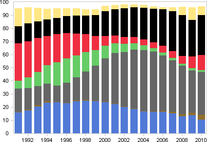
Registration of new cars by colors, in percent.
What do we see? At first sight: blue, grey, green, black, white – all go down at the end. At a second glance: you need a third look. Or depiled piles.
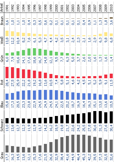
Piling can change direction. Terrible. Vertical figures are not that terrible.