The German Newspaper “Die Süddeutsche” uses graphic tables in its online edition. They show positive and negative deviations. In the same direction. Here, they always quarrel about that. Pro: It’s easy to compare absolute values. It saves space. Contra: You have to learn it first. And you need color.
Stripes are a la mode. No, no, no – forbidden! They emphasize where there is nothing to emphasize. Get rid of them. Lean is beautiful. This goes for bars, too. Just 9 pixels high instead of 14. The idea of graphs in tables is that of wordlike graphics. Graphs as large as a word. Bars don’t need to be larger than the text around them.
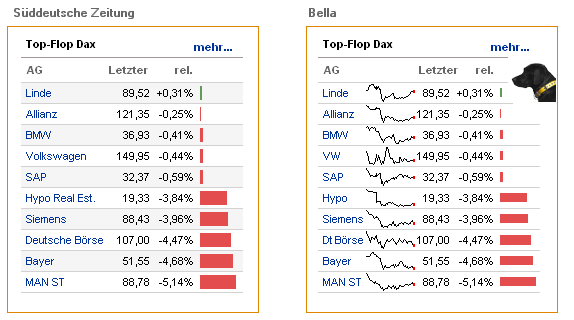
Know what: Sparklines are missing, too. They are the archetype of wordlike graphics. Read their pattern (“SAP came back from a deep fall and now drifts sideways”) or segment by segment (“VW dropped, went sideways, climbed steep, dropped very fast, climbed very steep, dropped again, climbed ever steeper…”). They offer information otherwise unavailable. To be precise: the table had 20 values, now has 440 values. Information density has increased by a factor of 22.
P.S. The sparklines show values from 2007-12-28 to 2008-02-28. You might dispute scaling, e.g. here.