I don’t recommend drawing circles. In a best case scenario, your readers will pull out their rulers to confirm their suspicions. One prominent botch job was placed in a forum and was promptly ripped to pieces. JP Morgan (unwillingly) submitted the evidence.
This blog is no fan of area charts. It’s hard to interpret them correctly and easy to understand everything wrong. (We even made a test to prove it. See for yourself!) What’s even easier, however, is to make botched area charts yourself – especially in Excel. Here, you can draw a circle diagram in which the ‘represented’ values are proportional to the diameter. That, of course, is wrong; the values must be proportional to the area.
A chart drawn by JP Morgan shows us what consequences that can have. It has already animated many people including the readers of Financial Times online and fans of ET.
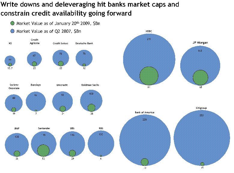 JP Morgan makes itself look bad so that its competitors look even worse. Click to enlarge.
It’s not easy to spot the manipulation. At a first glance, it looks as if JP Morgan did damage to itself. But did it? Let’s take a play-by-play look:
JP Morgan’s market value shrunk. Blue divided by green, in this case, 2007 divided by 2009 or 165 divided by 68 equals 2.4. In other words, JP Morgan’s market value was 2.4 times larger in 2007. The blue area, however, is 6.8 times larger than the green one. Oops … JP Morgan exaggerated its own downfall. The chart below illustrates the extent:
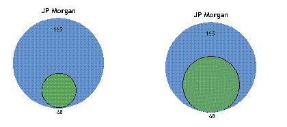
Left and wrong: The diameter represents the values.
Right and correct: The area represents the values.
Once again, it is as hard to see that the right chart is correct as it is to see that the left chart is wrong. As mentioned before, assessing areas correctly is extremely difficult.
Back to JP Morgan: JP Morgan applied the exact same exaggerations to its competitors as well. The only problem is that the diameter trick doesn’t always have the same effect. In fact, the more relative losses grow, the more area disappears.
If you draw circles around distances that have proportionally correct lengths, the ratio of the circles’ areas will equal the difference of the segments’ lengths squared. In other words: The exaggeration of incorrectly drawn areas is quadratic. Small differences are downplayed while large ones are overemphasized.
Do you think that all sounds really complicated? I do, too. This would have been a lot easier:
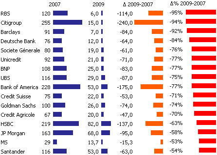
This is how the same data looks in a graphical table.
By the way, Archimedes discovered the laws of circles. But it didn’t help much. In the end, an angry Roman soldier misunderstood him – and slewd him.
