To chop or not to chop – that is the question for many information designers. We already know that we should never cut the axes of bar and column charts. But what about line charts?
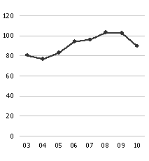
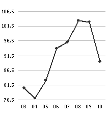
In a recent entry on perceptive priority, I claimed that both versions of the chart below are acceptable. Even when you chop the axis of a line chart, the proportions are not distorted. Ultimately, the angles in both charts remain relative to the changes in value.
 |
 |
|
Redesign: zero – maximum scale |
Redesign: minimum-maximum scale |
Nevertheless, some prominent visualization experts insist that you should never omit the base line – even in a line chart – because it exaggerates the differences. ‘Exaggerating’, mind you, is not ‘distorting’.
Others, including myself, feel that you should utilize the available space to realize the largest possible differentiation, which in this case means the largest possible resolution. This next important rule in designing graphics forces us to concentrate the axis around the relevant areas (i.e. the values). We can easily communicate the range in a simple sentence without images.
Of course, it always depends on the context:
When it comes to management reports, we should be able to assume that managing directors are capable of interpreting a labeled scale for their own data.
In a glossy brochure, however, people often misuse a minimum-maximum scale to dramatize small differences.
If you read this blog regularly, however, I am sure that you will be able to understand the difference.
