Dear marketing, we business people don’t need ISO norms or balance sheet guidelines to understand things better. Therefore please leave the color red to us. Because it means something. The same thing that it means everywhere else – namely, danger.
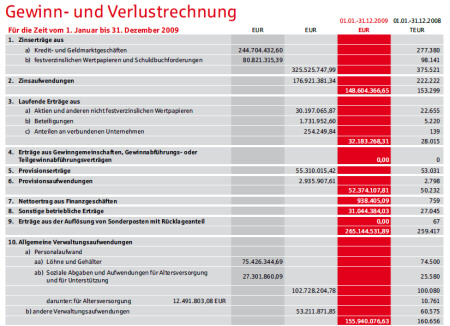
Last week, our corporate bank paid us a visit. It is one of the few institutions that is still considered a safe haven following the financial crisis. We spoke about this and that. At the end, I received their current annual report. After leafing through it, I became a bit pensive: The color red is part of the bank’s corporate identity. And all headlines were red. For example: Credit volume, Account deposits, Business developments, Results of operations, balance sheet, Profit and loss, Personnel. All in HKS 13 red.

Black numbers written in white on a red background: Enough to make any business professional skeptical. In this case, without due reason. Source: Sparkasse Nuremberg, Annual Report 2009, page 48.
For old-school business professionals, that is a definite no-go. After all, red differentiates good numbers from bad ones. Business people try to avoid having numbers ‘in the red’. A person who colors black numbers red, therefore, is suspicious and is definitely not a business person.
I didn’t like our bank’s breach against convention but considering that the rest of the annual report was highly positive, I was willing to overlook it. Since they are not a publically listed company, they don’t have any private investors who in times like these react a bit more sensitively to real or alleged warning signals. At E.ON or Vodafone that’s a completely different story. These companies also chose red as their corporate color – and both their words and numbers are consistently in the red right now. Bella has already poked fun at E.ON’s investor information. All of its columns, bars and lines for investments, prices, dividends as well as capacity expansions and cutbacks were colored red. Someone there obviously realized that Bella was right. The ‘bloodshed’ has been reduced in their current annual report.
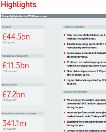
In comparison to that, Vodafone’s annual report is a horror show. Every number – no matter how good it is – is colored blood red in huge type print.

Large numbers; large and red. Source: Vodafone Group Plc, Annual Report for the Year Ended 31 March 2010, page 1.
It’s not just local banks, E.ON and Vodafone who dabble too heavily in red. It’s also publications like Die Welt, FAZ and the Wall Street Journal. The Journal, for example, always uses the color blue for the first value and red for the second value in charts – no matter what the content is. Each time I read the paper, I have to take a closer look to see if the second value is really worse than the first one.
Die Welt is especially bad at turning everything upside down. The time series lines for the Dax, Dow, euro and oil price on the first page of the finance section are generally red while the start and end values of the series are black. The percentage change compared to the previous day is blue when it increases and red when it falls. It’s a good thing that paper is so patient. That’s why it can cope better with the fact that all stock developments in the business section are red.

All indexes are blood red – regardless if they rise or fall.
Source: Die Welt, 2010-07-20, page 13.
That made me think back to my grade school days. Our teacher Mr. Kling always repeated the same saying until we committed it to memory. Substance and form make up the contents. That’s why wheat beer doesn’t taste good in a soup bowl. And that is what causes such a widespread misunderstanding. The context decides where the CI color fits and where it doesn’t. I don’t have any problems with Vodafone service technicians driving red cars and wearing red overalls with a red corporate logo on their chest. But then again, I don’t want to see every board member wearing a red suit at the annual press conference either. And just because the German postal service is yellow, using yellow as a font color – which would be completely illegible anyway – is no proof that they are using their CI consequently.
While working on a human resources project in Switzerland, I learned that it doesn’t have to be that way. We were asked to adapt our reports to the company’s CI – but ‘naturally’ doing ‘everything that is possible and feasible’. Its CI was subtle, tasteful and well thought out. I was almost jealous. It suited its original purpose – namely: to support the company through typography, tonality and color. You could really feel the bonding force in the company as well as its efforts to adapt its business to the very different needs of its international clientele. The pastel tone of the colors exemplified that the company doesn’t exclude anything or anyone, it accepts and respects other people and things – and doesn’t let itself get carried away with an evaluation or devaluation. For reports that deal with personal sensitivities, we could profit from this CI. Because when we want to show subjective views in a hard, clearly separated way, we signalize precision where there is none to be, where it may not or should be. For the reports on team and management levels, we took the liberty that the client gave us and delved away from the CI to use clear, simple colors and forms instead.
In the past, I often checked back regarding the usage of CI. The controlling department often said that marketing had decided that those were the valid design guidelines for the entire company. Hmmm. When I then asked marketing if that were true, the team was perplexed. Business standards always precede design guidelines. They obviously completely misunderstood what marketing had wanted. Okay. When successful companies color good numbers red, that is a loss for controlling and not a win for marketing.
