Thou shall honor these eight simple visualization principles of Edward Tufte – or have a darn good reason not to!
- “Compared to what?”
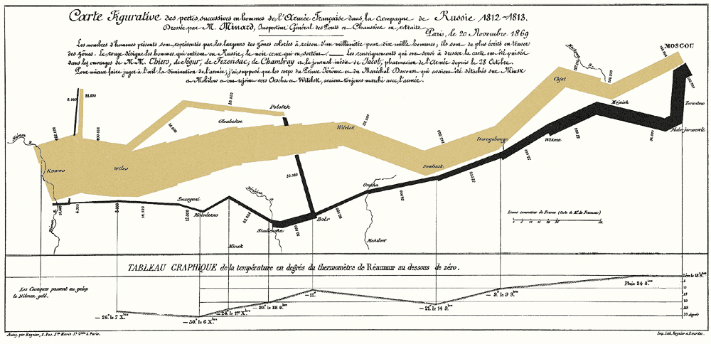
Analyzing means comparing. The main purpose of each analytic presentation is to enable comparisons – and ultimately classification, evaluation and understanding. Each presentation has to answer the question, What has been compared? Napoleon crossed the Berezina River. The black line is immediately thinner. The army’s size has decimated from 50,000 to 28,800 men.
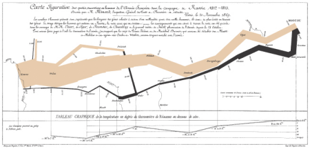
Napoleon’s March to Moscow, Charles Joseph Minard, 1869.
Click the image to enlarge. - Show causality
We want to understand relationships, mechanisms and effects. Napoleon was not defeated by the opposing army but by the harsh winter, as the temperature comparison shows at the end of the chart.
- Our world is multivariate. Our graphics should be as well.
The world that we want to understand has many variables. Minard portrays six of these in a single chart: man power, geography, the direction of military offensive and retreat, temperature and dates.
- Integration of words, numbers and imagery
The fact that today’s standard software has split the production of text, tables, charts and images into different applications should not lead us into the temptation to separate these means of powerful presentation from another. On the same token, just because copy writers, IT specialists and graphic artists sit in different floors of a company, is no good reason to place text, data and charts on different pages of reports. They belong together!
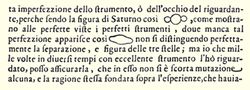
This is Galileo’s documentation of the first telescopic observations of Saturn’s rings. While modern texts make cumbersome references like “See illustration 4.16/2”, Galileo simply said “It looks like this” and placed his illustration there where it belongs – in the middle of the sentence. Saturn transforms from a drawing to a word and noun.
- Content counts
The final two charts that Minard created both show the loss of human life through war: Hannibal crossing the Alps over 2,200 years ago and Napolean’s invasion of Russia. The presentation is solely dedicated to and focuses on this content with all of its power. Neither Napoleon nor Hannibal appear in the chart; nor are they the subject matter. If a chart influences someone, it is primarily due to the quality, meaning and the integrity of the content. Whoever wants to improve a chart has to first improve its content. Good design can never compensate poor content.
- All information within eyesight
If we want to compare objects, we need to place them next to each other. Since computer screens have a much poorer resolution than paper, modern technology breaks down valuable information on many different pages after another instead of next to each other. Until computer screens get better, you should buy the biggest one with the best resolution and then place several of them in a row. Seriously! As a matter of fact, this is common practice for presenting highly critical information. Atomic power plants, back-up centers, airport traffic control and other similar institutions who can’t afford to waste a single pixel have chosen the route of wall-to-wall computer screens to keep every important detail within sight.
- Use multiple charts
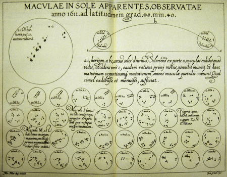
Multiple charts (small multiples) offer a compact, repetitive presentation of several variables, just as Galileo used for his observations of Saturn. This high information density makes it easy for us to understand their message. If an observer understands the general principle, he will understand the other illustrations as well. Their credibility is also very high because they always show all the data that is available. The general principles behind the individual charts just need to be clear and simple.
A Jesuit rival of Galileo reused his data on sun spots to create a multiple chart showing all 38 pictures at a glance.
- Don’t dequantify
Numbers are important. Only use presentations that contain numbers. Don’t reduce numbers to on/off, yes/no or here/there comparisons.
These eight principles are universal. They apply for the first map carved in stone over 6000 years ago just as they do for contemporary Web sites. Sometimes the best thing that information design can do is simply not to destroy good content.
Each of these principles demonstrate that thinking and design belong together. If creating a comparison is the challenge at hand, then the chart should do this as well. The principles of analytic design are the principles of reasoning about evidence. They are about visual thinking. Good design is the visualization of clear thinking. Start by asking yourself, “Which intellectual challenge should this chart help someone master?”
