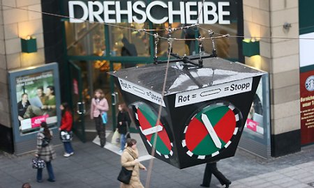
People who are looking for alternative ways to present numbers often let themselves be inspired by designs from tried and true products, for example cars, clocks and traffic lights. Today, we’ll take a look at some key things to consider and examine if coding numbers is even worth the effort.
I am biased. Whether they’re in watches or in cars, I just think that classic, analog, round gauges with needles are beautiful. I completely missed the era of digital watches. And I definitely couldn’t grow accustomed to the digital ribbon speedometer of my father’s Citroen CX – or the air suspension either. As a child I often got sick just from sitting in the back seat. Besides, my father bought that car in place of an Alfa Romeo GTV. I would be already too big and the Alfa too small.
A “Heuer” traffic light as shown here in Bochum, is analog – and was practical back in its time. It doesn’t just say that the traffic light is red. It also says how long.
But here, too, I’m biased: A number is a simple, compact, clear, space-saving description of a fact. If you are going to give up these advantages for a recoding and use a graphic instead, then you need good reasons. But, are there any?
Analog is the result of mechanics
Almost all analog displays originated in the time before electronic inventions. Displaying numbers mechanically is difficult. In the case of watches, for example, manufacturers have only been able to mechanically reconstruct the stop function using actual numbers since the current millennium. But that’s no reason why you should stop wearing a stunning, classical chronograph with analog totalisators. In the case of information design, however, old things aren’t necessarily the ideal.
Unknown scales
The “Heuer” traffic light shown in the picture above was an amazing invention. These lights, which were used in parts of Europe and even Australia from the 1930’s – 1970’s, were very practical because they showed how much time was left in the red or green phases. They did that, however, in a time increment that observers had to first learn. In contrast, modern equivalents display the remaining time as a digital display. That is better.
Reducing information
When we replace numbers with graphical elements, we must accept a reduction of information. Standard fuel gauges only work because you have learned that you can still go pretty far on half a tank of gas. When we fill up a tank one day with electricity instead of gas, however, we’ll see that “half full” doesn’t really say much and can’t help us make decisions. That’s how managers would feel if they learned that “The finished goods warehouse is half empty.” So, the score is now 3 : 0 for numbers.
Show the future
Anyway, what is of interest to us are the consequences and not the exact amount of gas that we have in the tank. We want to know how far we can drive with the gas we have. We want a forecast – and a little optimization wouldn’t be bad either. For example, should I refuel now or will I reach a gas station where the prices are good and there is no wait – even if I get stuck in traffic or something else happens in the meantime? What I’m trying to say is: fuel gauges don’t provide much inspiration for good information design.
Synchronization
Teaching robots to play tennis is hard. Teaching people, however, to assess the flight path of a ball and coordinate it with their own movements is comparably easy. Analog displays have a clear advantage when we have to synchronize the approximation to a certain value with a single action. When we take a look at a tachometer needle, it only signalizes the approximate number of revolutions per minute. Still, we quickly and intuitively understand the speed at which the needle reaches the red area as well as when we near or reach the logical point to switch gears. The tachometer in racing cars may be digital but the RPM display is almost always analog. That’s one point for gauges with needles.
Readability
A chronograph watch shows the stop time through the display of several totalisators. To tell the time, therefore, you have to first consult multiple displays. That takes time. Compared to a digital display the readability is a catastrophe. Every tachometer shows how hard it is to create good analog readability. An exact kilometer display is unthinkable on an analog scale – but easy for a digital one. That makes the final tally 4:1 for digital numbers.
So long live numbers, in measuring and presenting.

