Graphical elements are supposed to focus your attention on what is important. What they actually show, however, is often misleading. How can you avoid embarrassing mistakes? For starters, just steer clear of Excel chart wizards.
When graphical elements illustrate relationships among values, something usually goes terribly wrong. The basic rule is simple: The differences in the chart must be proportional to those of the values. Anyone who takes a closer look at magazines and annual reports, however, knows that this rule is often broken. Some people do it intentionally; others simply don’t know any better.
The following chart from the 6/2007 issue of SportAuto (p. 55) shows how extreme these distortions can be. The magazine’s comprehensive, expert test on sport tires was embellished with 5 different charts that exaggerate the actual value differences by up to 13 times. It is hard to believe, but true – just take a closer look at two of these charts in the right-hand column.
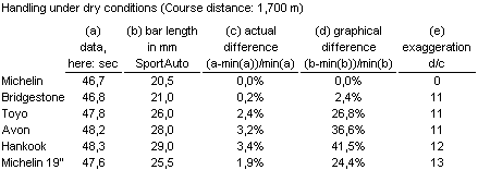
If you use a proportional presentation, the longest bar would be 3% longer than the shortest one. In the SportAuto chart, it was 41 % or 12 times (i.e. 41.5/3.4) that size. The distortion for Michelin 19? was even 13 times (24.4/1.9) greater.
How can that be anything but intentional? On the other hand, it could also just be sheer ignorance. Let’s see what happens when a naïve user plugs these same numbers into an Excel chart wizard.
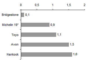
Excel distorts the SportAuto data. The chart wizard automatically cuts the axes and randomly warps the optical differences among the values.
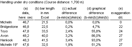
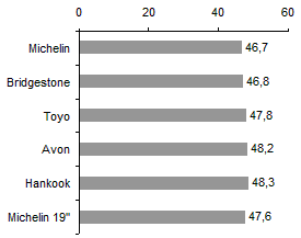
It is hard to believe how extreme the Excel wizard distorts the values. In this case, the longest bar is 93% longer than the shortest one, thereby distorting the value 27 times (93.0/3.4).
Excel simply chops the axes without comment – the equivalent of a graphical head-on collision. Excel also surpasses SportAuto’s exaggerations by distorting data 27 times more than the actual size.
Now compare the same data in a fair (i.e. proportional) presentation. The values in this chart differ by a maximum of 3% – and that is exactly how the chart looks.
Above all, what are the authors at SportAuto trying to say in the first place? The chart showing handling in dry conditions was probably supposed to show the difference in performance regardless of the length of the course. The small relative differences would add up into large absolute differences if SportAuto used their 20.8 km long home test course instead of the 1.7 km long handling course. In that case, 3% longer than a fastest time of 8:23 would be 8:38.
If the editors worked out the differences in this form, Excel would display them correctly by showing the variances to a reference value. Here is a comparison to Michelin 18”, the best tire in dry conditions with a speed of 46.7 seconds.
You can illustrate differences without resorting to graphical distortions if you use a coherent visualization concept and explain it. The chart above shows the differences between the test winner (Michelin 18”) and the other candidates.
