Last time we talked about cause and effect in texts – without charts. This time, the effect is in the chart and the cause is in the text. And the proportions work as well: many words, some numbers, and few charts.
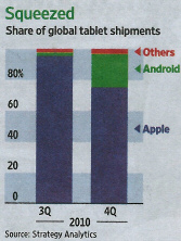
It is a well-known fact that Apple pockets 30 cents for every dollar that is spent in its AppStore. The newspapers and magazines that offer online editions for the iPad are no exception. This, apparently, has driven the competitors to provide the same service at a much lower price. Google, for example, only gets 10 percent for media offerings on its rival Android system. This could be the reason why Android has gained a considerable chunk of the market between the third and fourth quarters of 2010, thereby impairing Apple’s virtual monopoly on the market.
This article has just over three columns of text, 445 words, eight numbers and one chart that is smaller than a column. Still, we learned a lot about a topic that we probably would not have understood as well in a different way. Source: Wall Street Journal, 2011-02-18, page 32.
This quite interesting, yet relatively complicated story does not fit in a chart. At best, a chart can describe the symptoms. That’s how it is also done in the article above from the Wall Street Journal. This piece is definitely worth reading. I wondered: Could this article also serve as a model for internal reports? Could this be the right proportions of numbers, charts and text to explain a certain market development? If you are a fan of graphical visualizations, this consideration may surprise you. After all, this would be an appeal for a lot of text and few charts – even in corporate reporting. We’ll see.
Could they have gotten away with less text? Thinking back to our homage on titles, they could have just written something to the likes of: “Google gets 10 percent while Apple asks for 30. Android wins, iPad loses.” I don’t know. It’s rather long. The readers also need to know the relationship between Google and Android. Not the mention, there is no tie to the strategy. Perhaps, someone else can give it a shot. I personally believe that it should include 30 percent, 10 percent, iPad, Google, Android and possibly even AppStore. Besides, it would be a shame considering the headline. The word ‘risking’ has strong connotations and lets us know that the author thinks that Apple’s strategy was deliberate but chancy nonetheless. ‘App-lash’, too, is an interesting play on the words ‘app’ and ‘backlash’ – or possibly even ‘whiplash’.
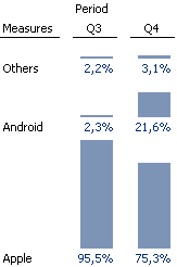
Could they have added more content to the stacked column chart in order to save more text? We have already bashed stacked charts in this blog before. This one, however, is rather nice and profits from the large shifts in market share for two of just three elements. You can see that the small green area is suddenly very large and that the almost blue fill has decreased drastically. This message is as clear as day. When you take a second glance, on the other hand, you will miss the exact numbers which are spread across the text and not easy to integrate into a stacked chart. Therefore, I made a few attempts with graphical tables which are automated and, therefore, such a pleasure to use.
![]()
Stacked charts – unstacked with graphical tables. Left: original. Middle: completely automatic. Right: re-formatted. As usual, labeling and legibility aren’t an issue anymore. You can debate the use of color. In this case, however, it makes the presentation more dramatic.
Yes, I think that graphical tables would look just as good in a newspaper article as they do in corporate reports. But that still does not change anything with regards to the amount of text surrounding it.
In our first blog on symptograms, we already learned that it is not enough to simply present an effect. Since charts can’t do much more than that, we need text to explain the situation and the causes. Today, we have seen that the right ratio between text and charts – regardless how we measure it – probably uses more text than pictures. In newspapers and anywhere else where you are dealing with critical readers, that is nothing new. We see it all the time – for example, in the article above or the annual reports of Germany’s DAX companies. In internal corporate reporting, however, you rarely see reports that have a considerable amount of text. The time, however, is ripe.
