Traffic lights in charts are junk. They portray the world in black or white – just using red and green instead. Because they use a bit of threshold voodoo, some people consider them to be an “intellectual” form of chart junk. That makes them even more dangerous – for report authors and consumers alike. And the worst part of it all? The alternatives are so simple.
I used to dislike traffic lights because they multiply the warning signs along the report hierarchies for multi-causal variances. Although this still holds true, I’ll admit that it is a bit complicated. Therefore, I am going to make another attempt to nip traffic-light charts in the bud once and for all. This time, however, I promise to be a bit more pragmatic.
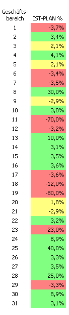 The chart on your left is a great example. You can tell that someone took the time and effort to set thresholds stating when the cells should be colored red, yellow or green.
This color coding is the result of an evaluation process. As readers, we also view it as such. Red signals “bad”, green is “good” and yellow is “okay”.
The report author is responsible for making this appraisal. That fact itself is striking, because the report consumers are actually the people who should be analyzing this information and using it to make decisions. In this case, the report author has already made one decision for them. And just as during downfall of Sachsen LB, we all know how that can go wrong.
The risks are high.
First of all, the report author has new numbers but is relying on the validity of old, pre-defined thresholds. He accepts the fact that this decision, made by a traffic light algorithm, has no smooth transition between something that is still good and something which has already turned bad. Furthermore, he completely overlooks the history of these values. That is a sin, because if you don’t know what happened in the past, you cannot view the variance in the proper context. If you want to classify something, it is important to know if it missed its targets time and time again.
At the same time, the classification into three categories is not well differentiated. All red and green variances are treated the same. A negative variance of -3.3% has the same weight as one with -80%, while a positive variance of 3% gets the same treatment as one with 40 %.
The biggest design flaw, however, is that the relevance of a deviation cannot singularly be determined by either a relative or an absolute variance. If you have to pick one of the two, as a businessman, I personally would prefer to know the absolute variance. A large relative variance of 25% doesn’t hurt so much when you are talking about €10,000. But a small relative variance of 5% is very painful when the budget was planned at €1 million.
These arguments show that the logic behind thresholds and the evaluative signaling of the colors could cost a report author his head. And they don’t save responsible report consumers time either. Before report recipients can decide what is important, they first will want – and have – to see all of the numbers in detail. The naïve report consumer, on the other hand, feels a false sense of security that just doesn’t exist in business.
The original objective of color coding charts was to help managers, who were plagued by information overflow, interpret their numbers more quickly. That is a tall order which can be met by simpler means without causing further trouble.
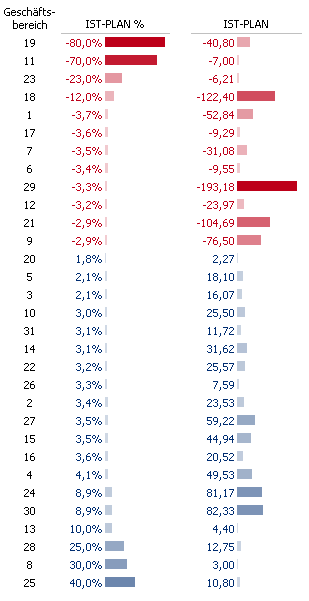
This second example sorts the values based on their relative variance. That alone is half the battle. Now, the most important variances are at the top. If all you want to do is identify the biggest problems using a relative variance, you could even delete everything below the fourth row.
This chart filters information without leaving a bad aftertaste. To understand the distribution, you just have to glance at the numbers.
This chart also provides visual aids by displaying the variances proportionally as bars. Unlike the primitive logic of red-yellow-green traffic lights, this chart uses two scales of varying intensities. They correctly rate the variances in shades of red and blue. The correct order is plain for the eye to see and even works in shades of gray.
If you ask me, if a computer codes values in color, than it should do it right.
When you observe absolute variances instead of relative ones, you get a completely different picture. Not to mention, from a business perspective the relative variance is totally irrelevant. Take a look at the chart above. Although the 3.3% variance for business division #29 looks trivial, it actually deserves the most attention because it caused the largest absolute variance.
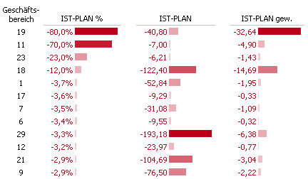
Of course, there are also circumstances in which relative change is important as well. In this case, it helps to use an abstract form of calculating variances: Multiply the relative with the absolute value and you get a weighted deviation and can then sort the objects based on both criteria.
I am convinced that traffic lights have found a regular place in software marketing and piles of unread reports due to the same misunderstanding that is inherent to gauges and thermometer charts. Business professionals have an innate desire for the security that engineers seem to have.
The tachometer in my car, for example, is a reliable sign that my engine will literally see red and eventually blow up if I don’t switch gears.
Unfortunately, however, we don’t have this security in business. Not only do we lack a gas pedal for accelerating revenues, we also can’t just put on the breaks to stop weird ideas.
