It is hard to top all of the praise and adoration given to infographics. They are supposed to help us understand numbers better by transforming them into images. Is that true? Do financial controllers need to be infographic designers so that people understand their data better? Or has someone just misunderstood how people understand things the best?
I’ve had a book lying on my desk for quite some time now. The title translates to “Stolz and Häntzschel’s World of Information – 105 Graphics That Simply Explain Everything” – a rather self-confident statement, I think. Our local newspaper “Nürnberger Nachrichten” just reviewed it on the weekend. The introduction sang the usual praises. Here is a rough translation:*
“In the mood for statistics? For a piece of paper or even an entire book filled with tables and endless numbers? That may make the heart of a technocrat beat faster, but before people like us can understand what a statistic is all about, we usually just set it aside half-heartedly. Isn’t it nice when creative people know how to visualize even the most complex issues as a graphic so that you only need one glance to understand what it is about? Attention statisticians: We love images!”
Explaining complex scenarios so that people understand them is a great thing. I personally thought of Megan Jaegerman, whose works even impress Edward Tufte so much that he has posted an entire collection on his forum. But: what makes her graphics so special has little to do with a “first glance”. In fact, the longer you examine her work, the more you learn from it. Those who read longer, learn more. A large part of that has to do with Jaegerman’s high regard for text.
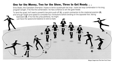
This is an example of how infographics look when they work. We learn something about the real world that we didn’t know before – even if we witnessed it firsthand. This is one of the many great works of Megan Jaegerman.
The criterion of the “first glance” for infographics is misleading. Bella’s blog is full of examples of how either the first impression can be deceiving or that a second glance doesn’t offer any proof that the first impression was correct. That was our starting point when we once attempted to make an infographic. A graphic from “Spiegel online” simplified the world to the point that it wasn’t even correct anymore. Let’s agree on one thing: With a first glance, you should be able to see what the graphic is about.
These thoughts were going through my mind as I picked up the book again. According to “Nürnberger Nachrichten”, we statisticians should take note because people “love images” and understand them at a glance. Fine. If the shoe fits, I’ll wear it:
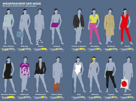
“Fashion revival” is the theme of this graphic. Which trends did many people wear in which eras? Visual presentation, frequency and duration of time.
Fluttering ribbons of time Infographics normally work to some extent when the topic has a visual nature. For example, how can you talk about fashion without showing it? The statistical part of the “Fashion revival” graphic shown above has room for improvement. The gray text on a gray background is too hard to read. This interesting data is too vague and the way it is packed in fluttering ribbons is rather sloppy. Cowboy boots had made a comeback? I didn’t know that…when? I can’t read it. Since the author didn’t draw the shirts, pants, and shoes with many details, he could have drawn them smaller and let the really interesting data such as frequency and duration take center stage. We haven’t gained beautiful insights about fashion or data.
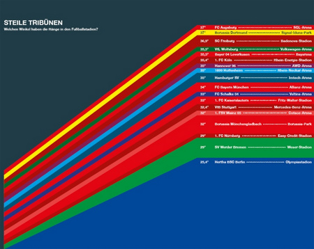
This graphic called “Steep bleachers” shows the different angles of the stands in German soccer stadiums. This graphic designer imagined the angular degrees as lines and then drew them wrongly as wedges.
Angles wedged Some of my colleagues who knew one stadium or the other found this visualization interesting. I puzzled for a while if I could motivate my eyes to look beyond the rainbow to identify the differences in reality. Besides, does it bother me that the perception of the largest angle differences could be obstructed because you don’t know where they belong? Look at Werder Bremen: The green wedge has two angles – the one from Hertha below and the one from Werder above. The stadium, however, only has one. Once again, we send our praises to the data collectors. It’s too bad, though, that the graphic made so little out of their efforts.
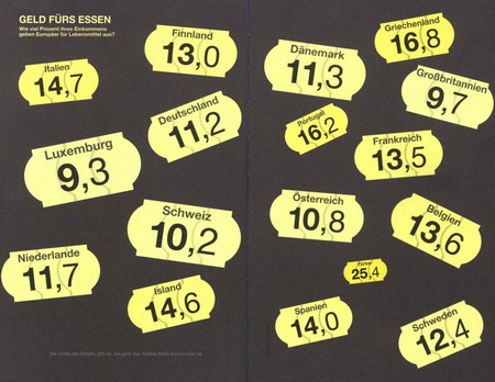
“Money for food” is the topic of this graphic which shows what Europeans spend on groceries as a percentage of their incomes. The net income is represented by an irregular area while the relative costs are displayed as a number.
Scattered numbers What we see at a first glance are unequally large areas in the shape of price tags, in random order, and with numbers whose arithmetic sizes are not proportional to the sizes of the areas. Pardon me? At a second (?) glance, we can see the explanation for the dominating graphical element in small print. The size of the tag apparently shows how large the average net income is. Sometime after I almost became dizzy from looking around in circles, I learned that the Turks earn the least and eat the most. Or do all countries spend the same amount and that leads to different percentages? Or do grocery prices vary in different countries?
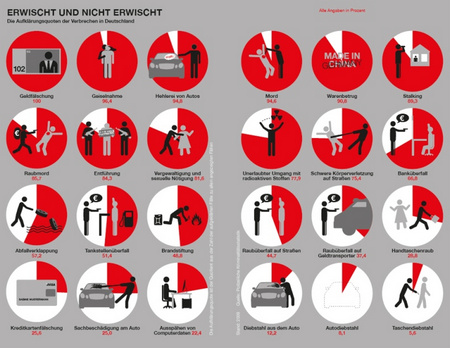
“Caught… and not” is the title of this graphic showing different crime-solving rates in Germany. The data shows percentages of a total. Red designates solved cases, which should be a positive thing.
Breaking quotas If certain symbols have permeated our acquired memories to the point that we understand them faster than text, there are many good reasons for using them. If the visual interpretation adds a new facet to an abstract term, that can be advantageous. In this example, I only had to read the word “gas station robbery” to understand what that means. The drawings triggered emotions ranging from amusement to anger. If I were a victim of a violent crime, I would not want to be confronted with this graphic. The stick figure drawings look so naïve that it is difficult to empathize with them as people. The fact that solved crimes are red and unsolved ones are white somehow fits together in this ill-fated image.
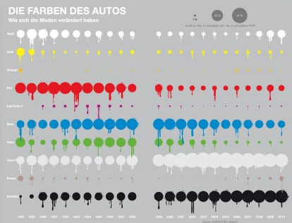
This graphic talks about automobile colors and how preferences have changed over time.
Spotted development How do you show how percentages have changed over many years? It isn’t easy, that’s for sure. Bella has also thought a lot about car colors. Now compare this solution above with Bella’s unstacked graphic table so that you can see what the graphic designer did to the data. Comparing developments gets interesting when you can see different speeds, temporary highs, a sudden rise, or free fall. To do that you need at least a certain level of differentiation, which is here covered up by a rough circle pattern.
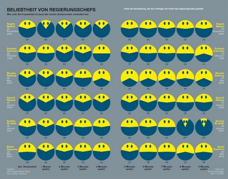
This graphic shows the popularity rates of six heads of government over their first few months in power? Smileys represent percentages. Where the graphic should display a wide grin, however, it shows a grotesque-looking grimace instead.
Furrowed percentages Text messages profit from emoticons, which make it possible to transport the power of a smile or frown with just two characters. Similar to human gestures, you can also use a few more pixels to make variations such as a huge smile, a stare, or even a slightly dissatisfied look. All of them work because the drawings fit our human facial expressions to a tee. In this graphic, the reader is forced to associate the highest level of acceptance with a grimace in which the corners of the mouth touch the forehead and the eyes are squeezed together. Frankenstein for President.
What lessons for management reporting can we learn from all this? Someone invested a considerable amount of time and effort into summarizing, in part, highly interesting data and used a lot of humor to create some beginner attempts at data illustration. Naturally, the graphic designers know that they played around with the data for a long time but used it to explain very little. The book has neither a table of contents nor page numbers. It is a picture book. I think the fact that the grimaces in the Smiley graphic were drawn for George W. Bush und Angela Merkel would be more likely to make people laugh – instead of making them rethink the way they design graphics.
Illustrating data is not the job of financial controllers. Finding ways to leverage the power of mental images, however, is. Whether I want to or not, I can still redraw some of the examples by heart. I still have a relatively good picture of the much-too-subtle timelines for cowboy boots. As statisticians, controllers, and managers, we can learn a lot about turning images and numbers into individually perceived units. But let’s use Megan Jaegerman as our role model instead.
* ”Nürnberger Nachrichten“, weekend magazine, 2012-10-20, p. 1.
