Good design breaks rules, from time to time. Two such rules are: Avoid symbols in most cases and circles in all. Today two exceptions provide surprising facets of detail.
One of the sources of this blog are charts I find in newspapers. I have thought long and hard about the ones in this post. Both graphics capture the reader’s attention. Both even seem to break several common rules for designing charts. Both look like they are more decoration than information.
In the case of the pirate data, I asked myself: Why would anyone count out the ships one by one? Is blue the right color for a hijacked or boarded ship? How many ships sailed without being attacked? And would it make sense (for once) to show that data in a map?
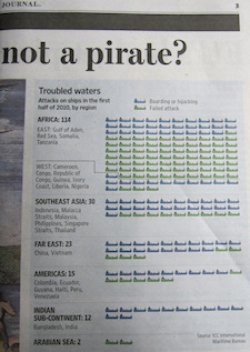
Pirate attacks on ships by region, in the first half of 2010. Blue ship: boarded/hijacked. Green ship: failed attack. Source: Wall Street Journal, 17 August 2010, p. 3.
The mushrooms in the Financial Times made it even harder for me: Why is the time displayed in two rows? Are circles not bad enough, why did they have to use mirrored semicircles? Why should I have to calculate the percentages myself? (After all, there is no way that I could just make an educated guess.) Why are all borrowers red but the European ones green?
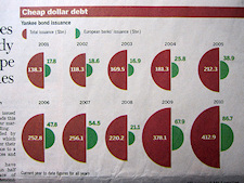
Total bonds issued in the USA to foreign borrowers. Red mushroom: all borrowers. Green mushroom: European borrowers. Source: Financial Times, 23 August 2010, p. 13.
Nevertheless, I liked both graphics – the pirates more than the mushrooms – from the beginning. And the more I looked at the mushrooms, the more they grew on me, too.
In the case of the ship counting, I realized why more quickly: Each ship symbol stands for a ship that was in trouble. First of all, it reminded me of the same idea in „One figurine, one person“. And in these six months one ship was attacked each day on average. I personally think that the idea of encountering pirates on open seas is very dramatic. Therefore, dramatic events that are countable deserve a symbol for each event. This concept would not have fit well on a global map. And besides, it is not important to immediately recognize the exact relationship between successful and failed attacks. Criticizing the colors or symbols is a trivial attack which seems out of place considering that grappling hooks, machetes, Kalaschnikows and rockets are involved.
The mushrooms are a little more difficult and are not suited for praise either. But, if you take a closer look, you don’t need to spend a lot of time to compare the areas with little success. Since the semicircles are mirrored and centered, their radii are located next to each other. That, at least, makes it possible to identify the development of the series – and even the percentages of European issues to all issues – to a given extent. Besides that, the clearly legible numbers dominate the chart.
Both examples have a common trait that we have not yet summarized as a rule. The data in both graphics is not sufficient for further analysis. The background reasons for modern piracy or the relationships in financial markets are way too complex to display in a chart that would make us believe that the context is as easy to understand as it is to draw. This ambiguity and indecisiveness suits the graphics well. Each chart reflects a phenomenon and hints at a trend and, most of all, says, “Don’t trust me too much, read the related article because I can’t really explain the context.” And in both cases, the article’s content was well worth reading.
So: soft drawing is allowed.
