The trilogy is complete: We have published sparklines in three different ways on newspaper. That’s reason enough to take a breather – and take stock of our efforts. We now understand why newspapers have to gather up their courage before they follow in our footsteps.
We’ve done it – but it wasn’t easy. Printing sparklines on paper is an adventure. Enriching sports standings with dichotomous word-sized graphics was easy in comparison. Weaving sparklines into text required a dedicated partner as far as the layout was concerned; after all, you can’t exactly break a sparkline down into syllables. Our DAX sparklines, however, were equally exciting for all parties involved.
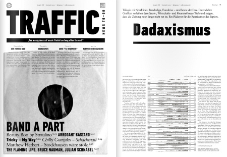 Yes, we can again: Stock-exchange sparklines on paper, in the September issue of Traffic News-to-go. This time without Jeff Koons.
A normal office doesn’t have the type of printer that can simulate the print quality of a newspaper. Needless to say, our sample printouts missed their mark. Our most important question was: How wide should the gaps between the columns and how wide should the columns themselves be? After all, the reader should be able to clearly identify patterns in the rows. That requires thin columns that stand relatively close to each other. On the other hand, the columns shouldn’t stick to each other either.
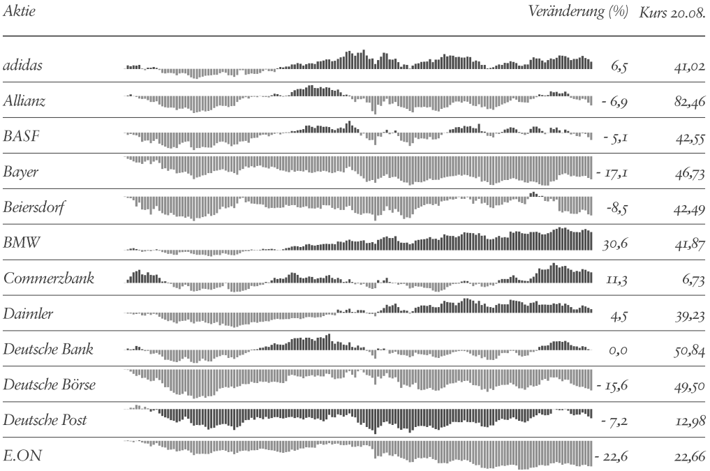 On paper in the same size, these sparklines are as sharp as a pin. In the Web, they are only legible when they are enlarged and viewed in smaller sections. Sparklines from 4 January – 20 August 2010 and the percentage variance to the stock prices on 4 January. Individual scaling per share. No liability.
Whoever got hold of a copy of Traffic News-to-go might want to take a closer look at the DAX line with magnifying glasses. What you can see then – what with unarmed eyes looks like fully printed flat color columns – is amazing and clearly shows why we software people only trusted the apparitional, physical alignment of the microscopic ink droplets once we received the special delivery containing the error-free, professionally printed results.
We also wracked our brains on how to show the stock price developments in a mathematical sense. Scaled individually so they wouldn’t be comparable? Scaled globally and many of the rows would be too flat? Sparklines are only sparklines if they can pass as word-sized graphics – in other words, they have a height that is about as tall as a row. This really limits any chance of differentiation. Plus, you can only use a logarithmic scale for lines, but lines cannot identify the breakdown by periods. Finally, we decided on indexed column sparklines – even though the starting point can only be set at random.
We kept our ranking conservative. Sorting the shares by performance instead of alphabetical order would be an appropriate means to separate the best from the worst performers. Personally, however, I am not convinced by the rationality of these types of comparisons. In addition, sorting the values based on the changes would have made our starting point even more random.
So…what have we learned from publishing sparklines in newspapers three different times? Paper has a great advantage over electronic media because the higher print resolution also creates a higher resolution for the sparklines. In this case, a higher resolution means: finer, more detailed, more exact, more attractive and more insightful data. Nevertheless, sparklines are highly challenging as far as formalities and content are concerned. Dense data is deep data that must – yet, at the same time helps – permeate the topic that it is describing. And that would apply for editors, publishers, politicians, voters as well as us readers.
