Some charts need more than 1,000 words. Yet, sometimes, seven words can be more effective than a chart. Today, we will put an end to the myth that all charts are pictures – and chatterboxes as well.
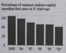
A short time ago, I sat and stared at a simple chart for a rather long time. It showed that venture capital companies are investing a smaller portion of their money in IT start-ups. To be exact, this percentage fell from about 60% in 2005 to under 40% in 2010.
This chart has minimal labeling. I had to guess the values. To find if the current reduction is just as strong as it was in the beginning, I would have needed a ruler and a calculator. I didn’t bother.
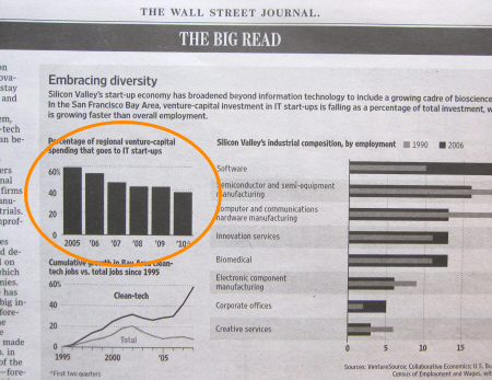
Paradox: When it comes to informing readers, the chart on the upper left contains too much data – not too little. A good headline could have easily replaced it. Source: Wall Street Journal Europe, 2010-10-25, p. 15.
I got to thinking. How exactly do we need to know that? Would it be redundant to say what we see in the headline? Would it have made a difference if the columns were labeled with values? Would a sentence – such as ‘VC investments in IT start-ups have consistently dropped since 2005’ – have been better?
I started to search for headlines and learned: Language can be a very efficient way to explain numbers. The Wall Street Journal is especially adept at this. The sentence ‘Australian dollar reaches a 28-year high’ (1) succinctly says what a long series of exchange rates over the given time frame would show in a chart. What’s more, it only requires a bit of the precious, limited space that we can see within eye span.

Some sentences are so precise and believable that you don’t even miss the visualization and proof that a chart would provide.
Something that you can’t explain with numbers at all is connotation. The headline ‘Apple’s iPad opens new frontier, may challenge primacy of laptops’ (2) is enough to give anyone goose bumps. Even the internal sales records from Apple can’t say what this sentence does. If PC manufacturers feel this way as well, they will do everything in their power to take the lead in the tablet PC market. The concept that is conveyed through the words ’new frontier’, ‘challenge’ and ‘primacy’ uses strong nuances and imagery to illustrate this view. Even forecast numbers would lose their impact considering the effects that substituting a technology that first had an unsuccessful debut and then was relaunched in a playful manner could have on a leveled-out market.
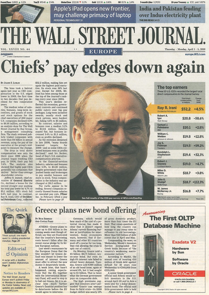
Other sentences have such a strong connotation, that they do not lack any numbers at all. Source: Wall Street Journal Europe, 2010-04-01, p. 1.
Yet, language works the other way around as well. Manipulation unmasks itself faster in words than in charts or in tables. Sentences like ‘The price of wheat has exploded’ or ‘Speculators drive the price of wheat’ designate an interpretation and not neutral information. Sentences like ‘Euro hits 8-month low’ (3) and “Santander profits up 13%’ (4), in contrast, have integrity – which is why we don’t need the corresponding chart.
Conclusion: It takes less time to read something than to understand the abstraction in many charts. Language delivers connotation, numbers and number words are already an integral part of language. In other words, language competes with charts. We simply need to decide, case by case, the fastest way to communicate our message.
Quoted headlines from the Wall Street Journal Europe: (1) 2010-10-15, p. 4; (2) 2010-04-01, p. 1; (3) 2010-02-05, p. 23; (4) ibidem, p. 19.
Get more information on this topic from previous articles:
