We want to be able to measure the quality of reports. Today, we’ll go into detail. For example, how large, long and wide should graphical elements be? The quality measure “differentiation” answers this question with a resolution in €pP or %pP – Euros or Percent per Pixel.
Most business graphics waste precious space – that’s why I wish nothing less than their utter demise. I personally recommend consolidated graphical tables in their place. With their help we can dramatically increase the data and information density in our reports.
Graphical tables integrate elements which guide the eye but reduce them to a minimum. So how do we determine what’s necessary and what’s not? Let’s take a look at a sample graphical table from the German newspaper DIE ZEIT (March 5th 2009, p. 33). It depicts the per capita consumption of organic food in selected European countries.
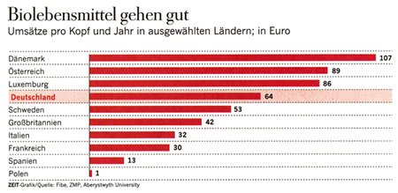
This chart could even illustrate a difference of 0.33 euro. In this case, that’s way too exact. The differentiation is too high.
I think that the style and build of the chart above is very good. It’s not three dimensional, the labeling is accurate, and it’s easy to read. The differentiation, however, is exaggerated. And we know that because we measured it. On a computer screen we can assess differences in pixel lengths relatively easily. If we print charts, we can be even more exact. But let’s stay with the pixel, the resolution that is used for design on computer screens.
The chart in DIE ZEIT is printed on paper. After we reconstructed it on a computer, we were able to measure an accuracy of almost 33 cents per pixel. The largest value was drawn with a length of 324 (i.e. 107/0.33) pixels. That means that this chart could even illustrate a value difference of 0.31% (i.e. 0.33 EUR/107 EUR).
If a maximum bar length of 100 also sufficed, each pixel would represent a difference of 1.07 EUR. That is still pretty accurate for the data shown here. The smallest difference is between Italy and France where per capita sales of organic food only vary by 2 euros. In other words, we would only need approximated 54 pixels (i.e. 107/2) to illustrate that – if we wanted to, of course.
![]()
Accurate enough and much more compact: a maximum of 100 pixels equals a differentiation of slightly more than 1 EUR per pixel.
Fans of sophisticated data analysis would probably interject at this point saying that this is all very nice but they would prefer to show the differences to a set reference, for example, Germany. That way, we would quickly see that Germany lies in the midrange of European countries regarding the consumption of organic foods.
Our second example below, which shows the number of nuclear power plants worldwide, suffers from too little differentiation (Handelsblatt, April 30th 2009, p. 12). Instead of pixels or dots per inch, it uses some random bar as the smallest unit of measurement. If you use the maximum value of 104 nuclear power plants in the USA as the reference, one bar would be equivalent to 9.5 (i.e. 104/11) nuclear plants. That’s where things start to get a bit inconsistent. 1 bar symbolizes 11 plants in China but 7.5 in the Ukraine. Ouch, that’s a distortion of 47 %. Maybe the number of bars is “normed” based on a certain country and the visualization would be consistent if we knew that. (We have measured that again: In France 1 power plant means 0.102 (=6/59) bars. If you know that and if you round it to integral bars, the rest falls into place.) But even that fact doesn’t make the graphic correct. After all, two bars symbolize anything between 15 and 20.
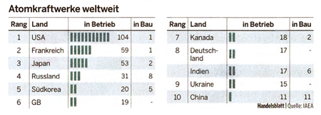
Bars instead of pixels: Here the finest-grade resolution is 9.5 (104/11). That is way too low – and it’s a botch job besides.
For those of us who cherish pixel aesthetics, this is almost tragic. This botch job didn’t even make the chart more compact. If we gave this chart the same maximum width for graphic elements, it would look like this:
![]()
The same maximum width delivers a correct and adequate differentiation.
True is: As a quality measurement, differentiation helps us avoid exaggerations as well as understatements. If we cannot see major differences graphically, our visualization is too vague. On the other hand, we are too precise (and probably waste too much space) if we could identify differences that don’t even exist in the data or fall into the tolerance range due to measurement or collection errors.
Within these boundaries, which differentiation we choose is generally a question of connotation and tactfulness. When we use it, we should inform our readers as well, for example: “Resolution: 1,000 € per Pixel.”
