When people talk about visualization, they tend to refer to two separate sub-divisions of the human species: numbers people and graphics people. As the name suggests, the first type understands and loves numbers – especially in the form of tables. Although graphics people don’t, they understand the context just as quickly when it is visualized in bar charts.
People who believe in this type of visualization Darwinism like to substantiate their arguments with comments such as: “Just imagine…you are supposed to be able to derive the profit growth from this table. Only a numbers person can do that!”
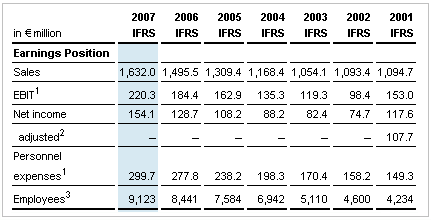
Source Hugo Boss AG
Then they will show a chart similar to the one below and say, “Now look how a chart explains that same message. You can see the profit growth immediately.”
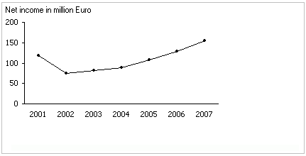
Visualization of the table above (only net income data)
Yet, those who don’t feel that they can be categorized as pure numbers or graphics people might object to this “proof” with the following, somewhat philosophical arguments:
- In general, a chart encrypts. And what does it encrypt? The numbers! To understand the encryption, you first need to decode it – and then you end up with numbers again. After all, if a person doesn’t know what 50 percent means, then he or she won’t be able to understand the value of a half of a pie either.
- Even people who love numbers will use charts wherever they clarify the message and avoid them whenever they do not. It sounds very hypothetical to say that a chart and a table are equally suitable and that the reader will ultimately decide what is more understandable.
- As I showed many times with examples of graphic tables, the combination of graphical elements and numbers is better than either a pure table or graphic because it answers many questions before you can even ask them.
If you take a very close look at the example above, you will also see that both visualizations are not comparable. In the table, we see that the initial values were translated into increases in the chart. These increases, however, represent changes. In other words, we see the values over several years in the table and in the chart we see the changes among these values.
And what, pray tell, would all species have the easiest time understanding? How about a simple sentence:
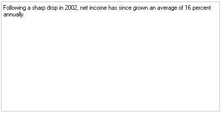
An information-dense statement
